March 2, 2023
accessories, earthy colors, home design, interior design, kitchen, kitchen accessories, Kitchen Nook, Light Fixtures, neutral, paint colors, remodel, textured walls, textures, tile, white oak
Our stonechat project is an office favorite! Strictly because this client had an eye for design and she was willing to push the envelope! And the final result shows…its breath taking everywhere you look!
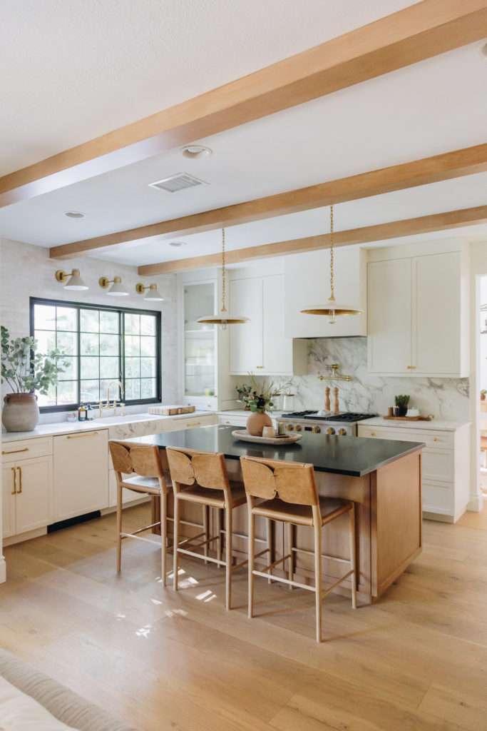
The original kitchen was dated beyond belief. It was original builder from the 80’s and it showed. The peninsula with the bar height cut off this kitchen and made it feel even smaller than it already was! So needless to say, no matter what we did in here it was going to be a HUGE improvement.
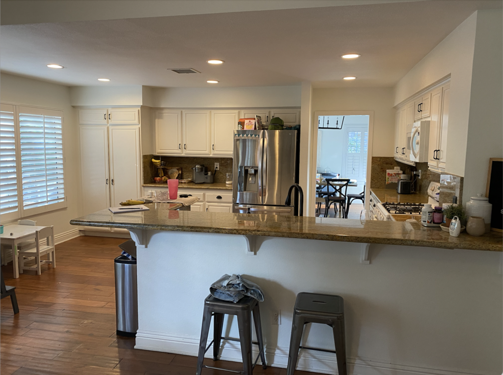
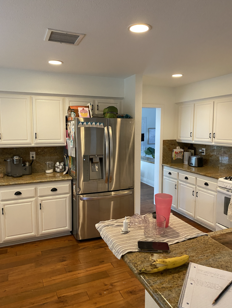
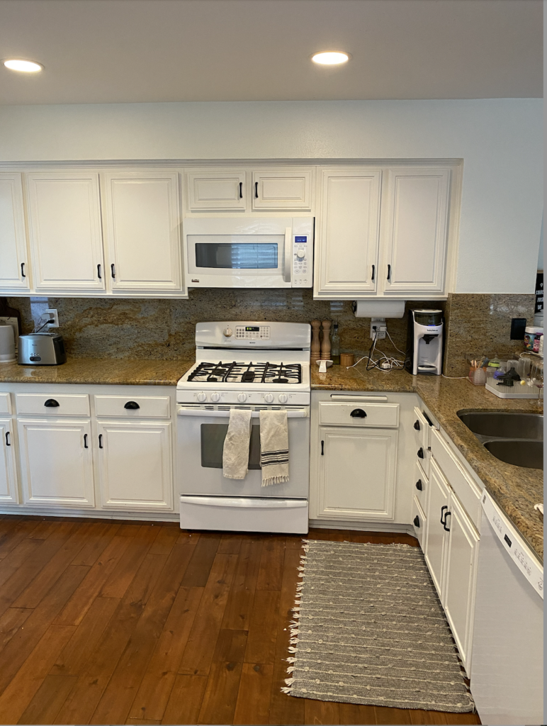
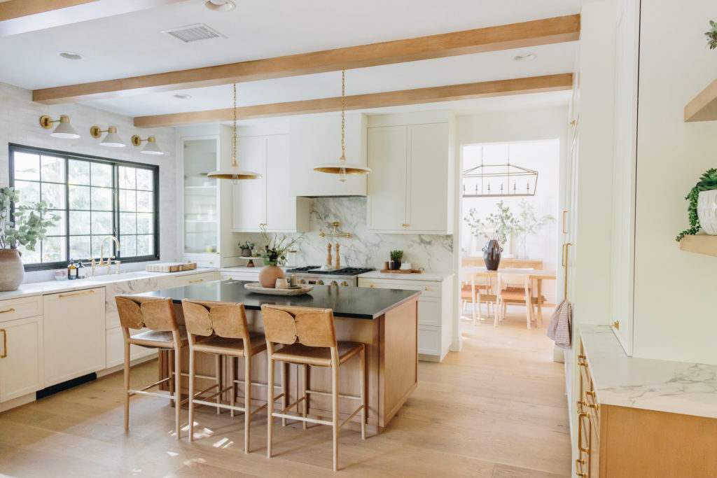
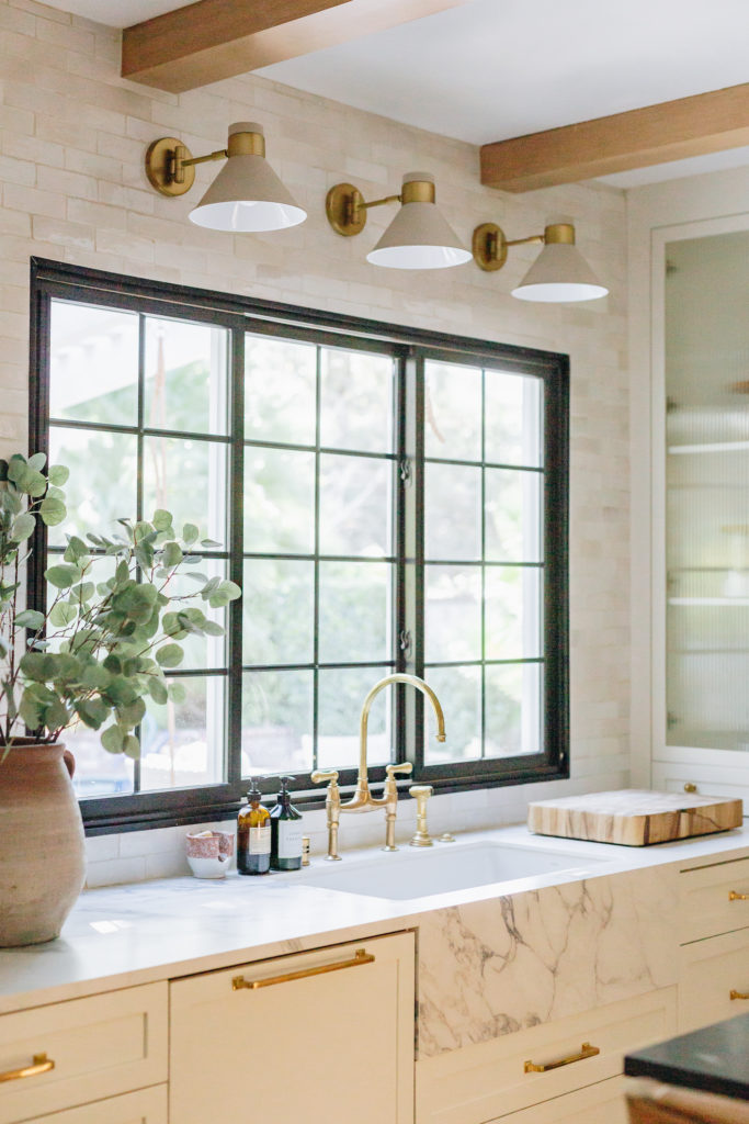
We completely moved this kitchen around, opened up some of the doorways and ended up with what I think is one of best uses of space! The sink got moved to the window wall, the refrigerator got moved to the stove wall, and the stove got moved to give the best hood moment we can get in here! The plaster hood over the new freestanding range is another added layer and necessary texture to give this kitchen depth.
And then can we talk about the island size we were able to get in here!
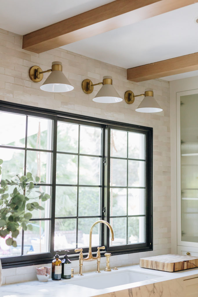
Pro Tip: Bring in wall sconces above windows for a more custom design
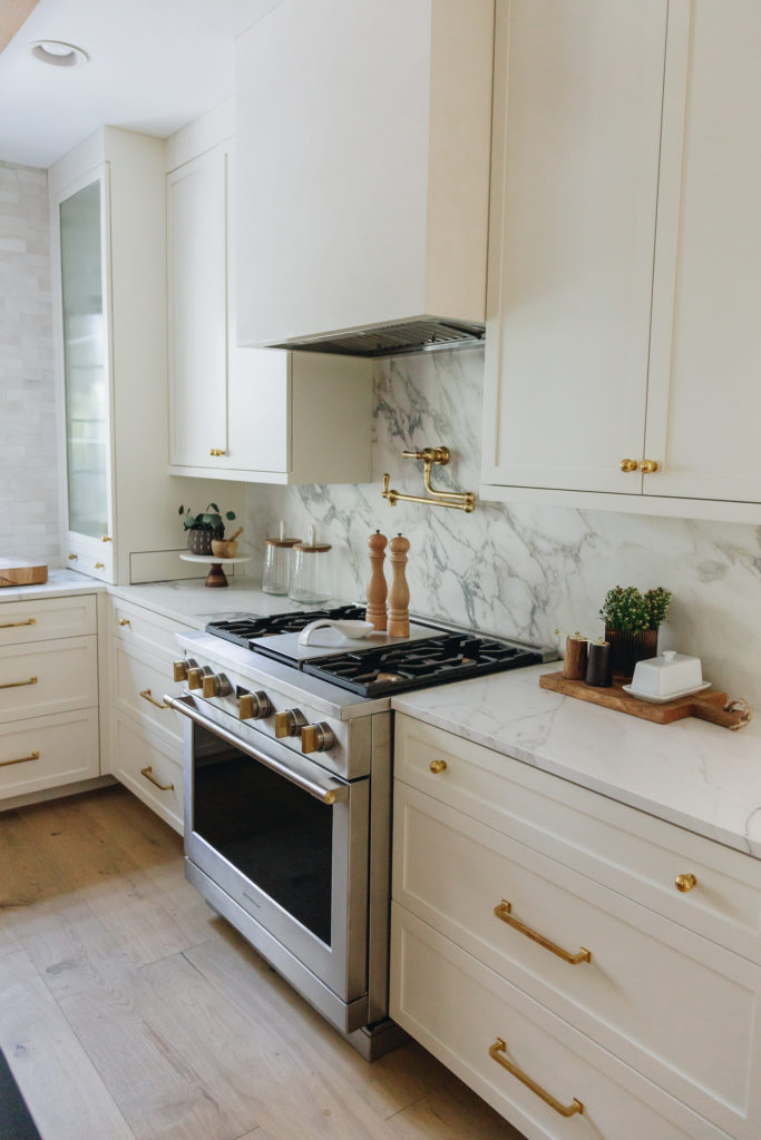
Adding a large pantry with pull outs, an appliance garage for all the hidden appliances, and the panel ready appliances took this kitchen to the next level.
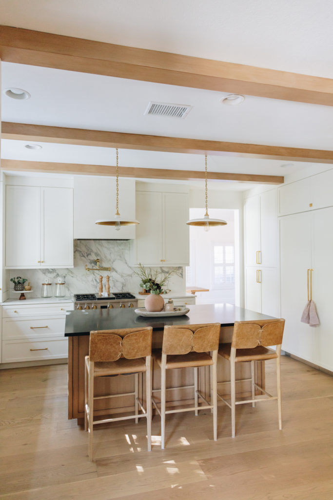
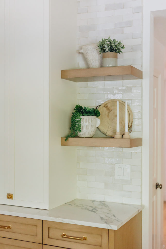
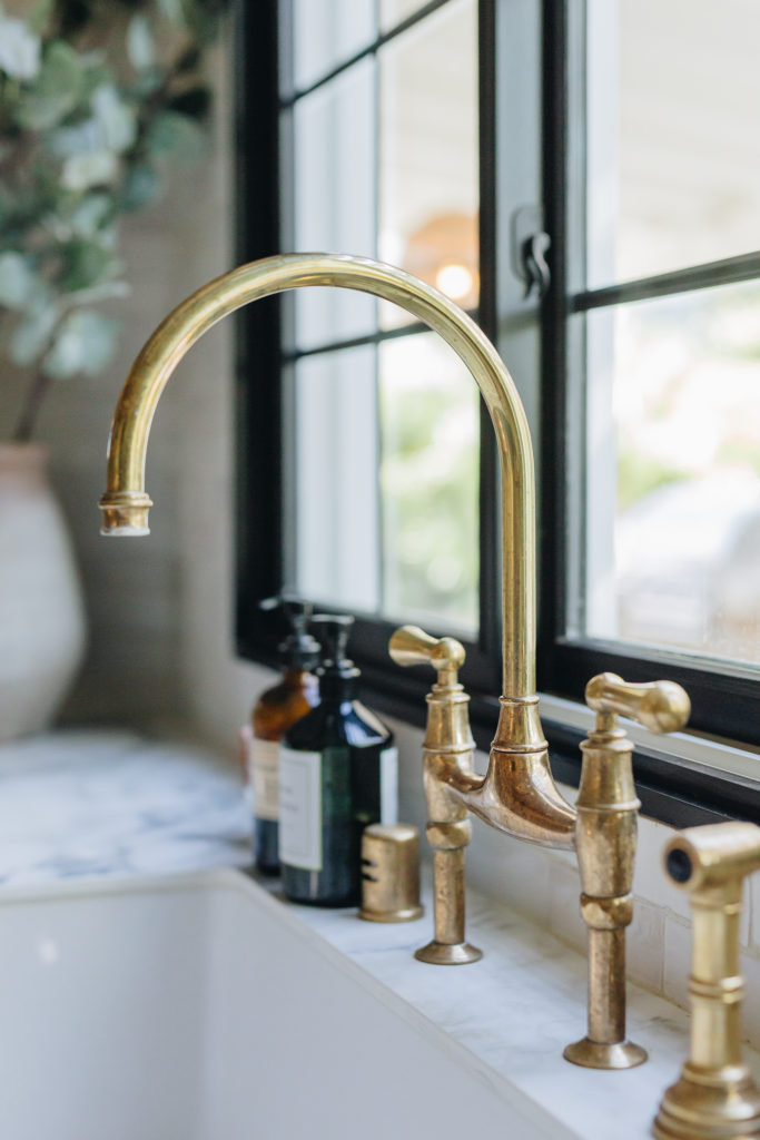
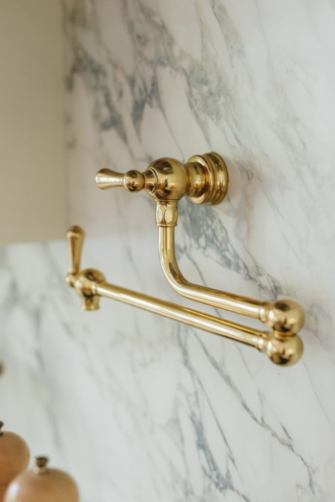
This kitchen is layered with textures with the raw and organic backsplash, mixed porcelain and soapstone countertops, combination creamy white and wood cabinets, and dripping with brass lighting fixtures throughout.
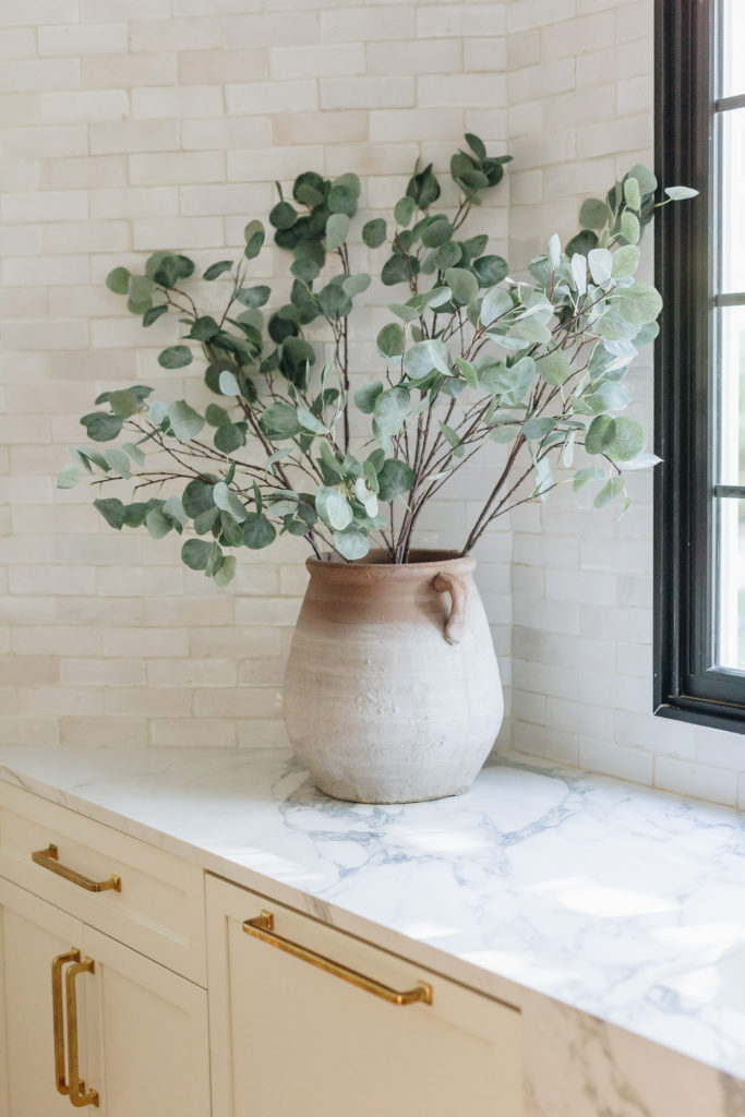
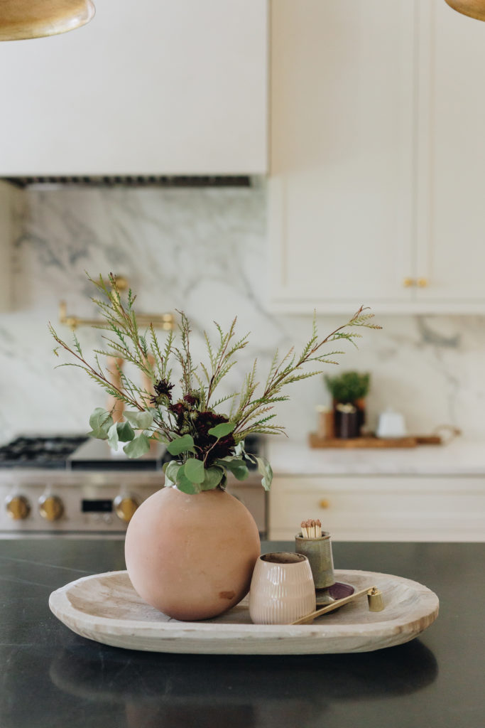
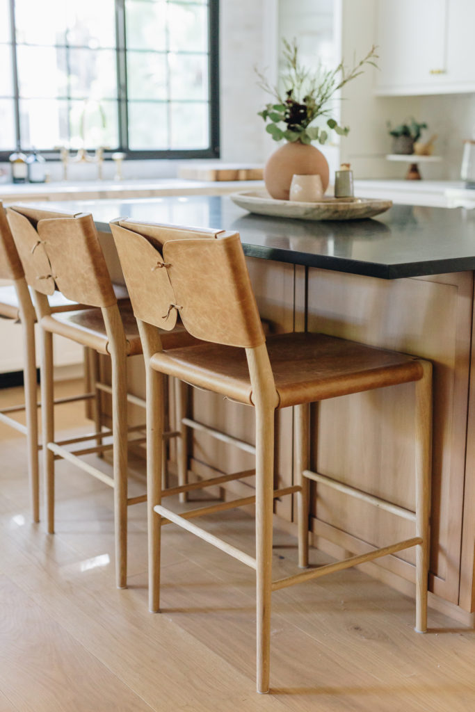
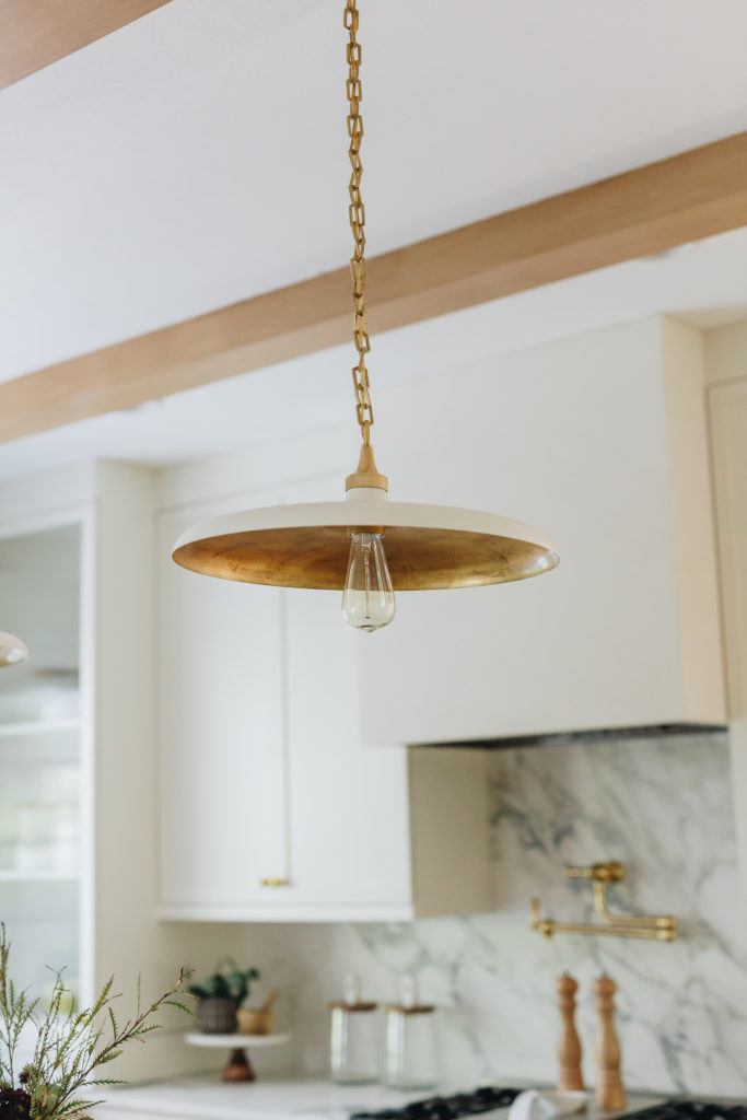
The mixes of vintage elements and the beautifully warm wide planked European Oak wood flooring throughout was the perfect backdrop. The large black framed window in the kitchen brings in more natural light which adds to the richness.
