
November 6, 2020
Light, bright, and airy. Exactly what you would expect out of a beach house right?
Well that was our goals for the design of this spacious home. The open floor plan lent for some amazing views of the well thought out spaces that play a roll in the overall feel of this coastal retreat.
We wanted this space to be inviting and timeless, yet still have a unique twist perfect for our clients needs. We chose neutral colors, adding in pops of greenery and different textures to finish off the space.
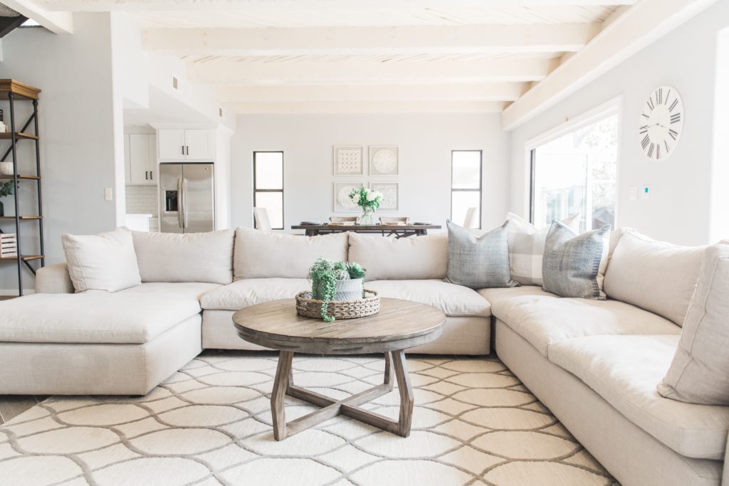
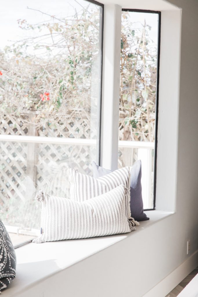
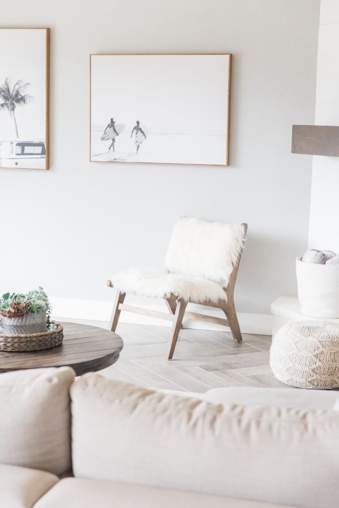
The family room is home to an oversized sectional, accented with a fun chair to add more seating. We also included some ottomans to kick your feet up and make the space feel more inviting. We brought the beach inside by using some fun wall art that perfectly accents the oversized windows and bi-folding doors that bring in ample light. Lots of accent pillows were used between the window seat and sofa, so here we were able to bring in more textures and patterns.
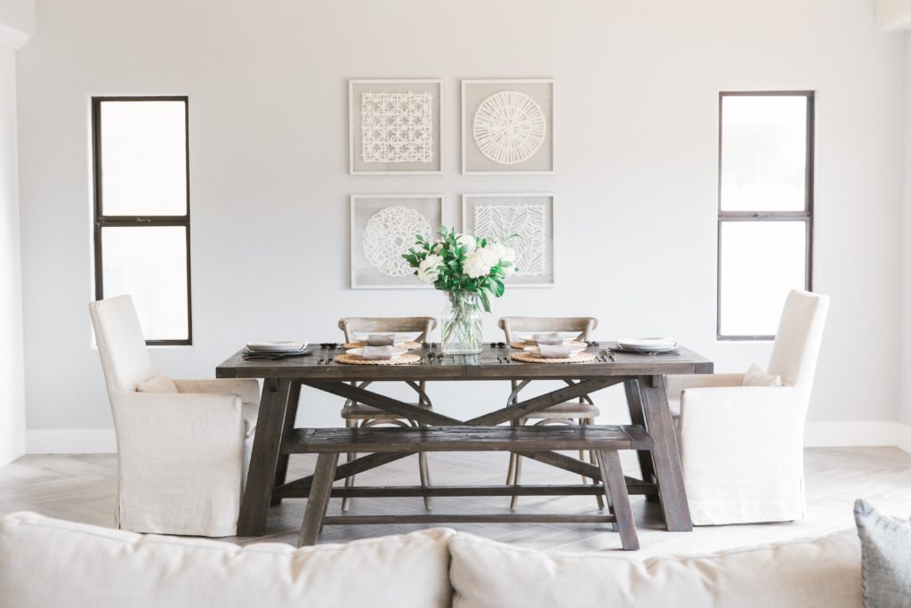
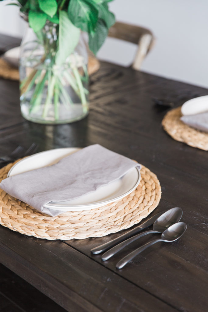
The dining area is another place where we brought in more texture. The wood table and seating, lent for the perfect linen head chairs and fun place settings. We used a simple large vase of greenery as the center piece which brings your eye to the wall where we hung four unique pieces of art.
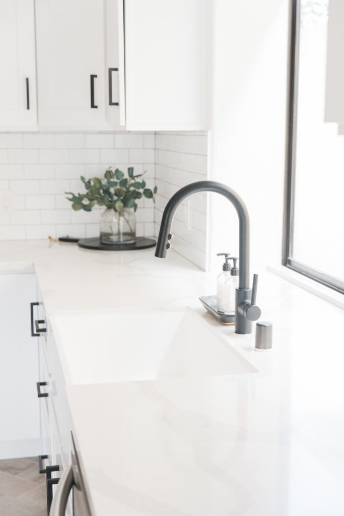
From here you enter the kitchen which is beautiful on its own, but definitely finishes off the space perfectly. This space is usually the most costly to renovate for our clients. But we were actually able to save here and splurge elsewhere.
Where we splurged:
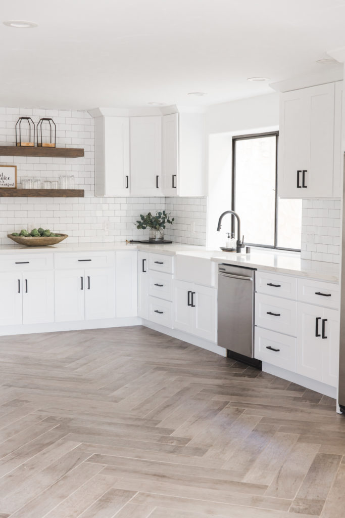
Because this floor plan is so open we wanted to really be mindful of the flooring we were selecting. It would be seen all throughout the house and we really wanted it to be a statement. This was a great opportunity to splurge and select a show-stopping material. We chose the wood-like tile, installing it in a herringbone pattern, that gave for a fun yet timeless look.
Where we saved:
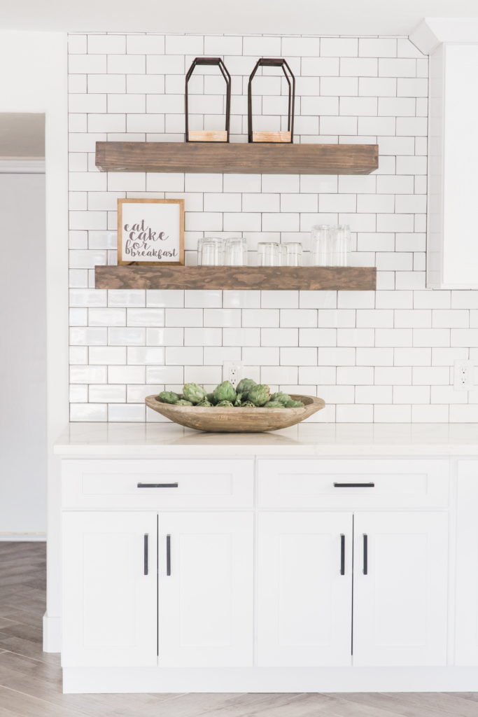
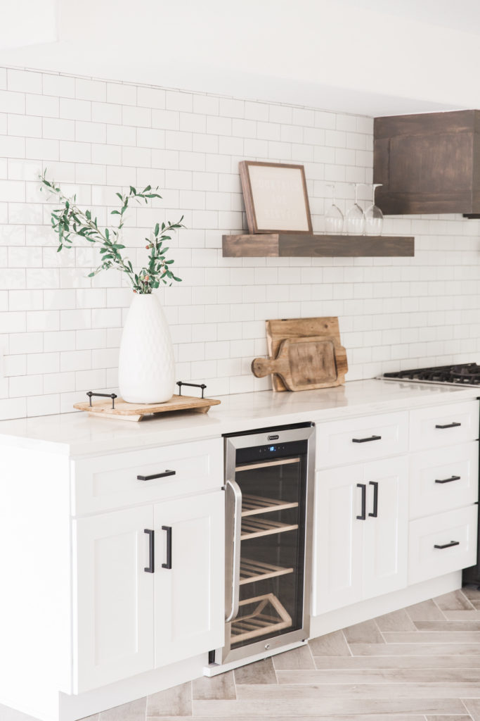
Because the kitchen is so large, we were able to save on selecting pre-fab countertops. This cut down on cost (but not style!) because we could avoid having to pay for fabrication and full slabs leaving us too much material after install. Another way we were able to save in this kitchen was by selecting a lesser expensive backsplash. We chose a more simple, yet timeless subway tile installed with a colored grout and choose to use it on the main walls giving it a more impactful look. Since we were able to save on the cost per square foot of the backsplash material it made it less costly to use overall. The last way we were able to save in cost but not sacrifice any design, was the floating shelves in the kitchen. Who knew that such a beautiful addition could save money right? Well these shelves cut cost because it eliminated two full walls of cabinetry. They still offer a great storage solution as well as a way to display some pretty glassware.
The design of this house is timeless yet eye catching, just what the clients wanted. They were looking for somewhere for friends and family to gather, that felt like a vacation everyday.


