August 25, 2021
Who doesn’t love a good project photo dump..and when the project is as good as our Clifton Project a post fully dedicated to this beauty is so worth it! Enjoy some of the tips provided and sources for a few of our favorite items!
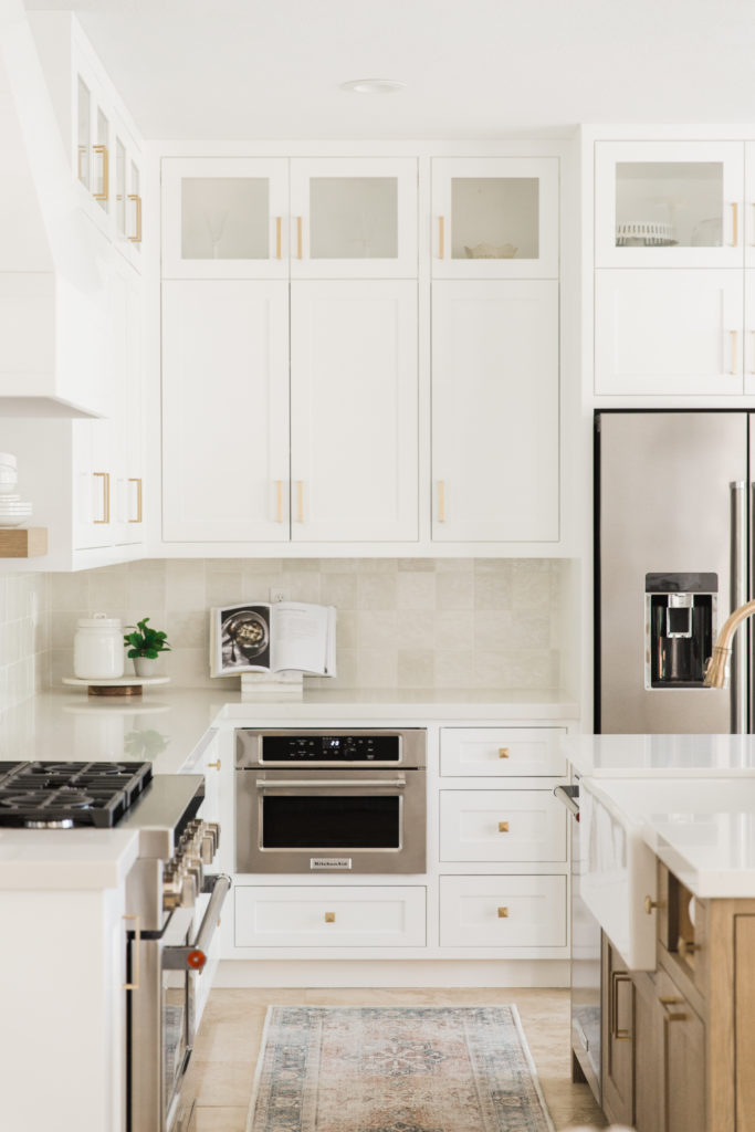
and is a great addition to any kitchen
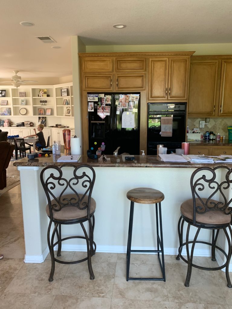
First of all..lets start with where this baby started…brown cabinets…a bar top that was so not functional…old school builder granite…and lighting that was awful on your eyes!
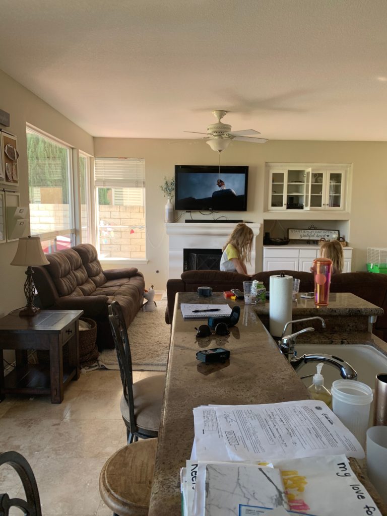
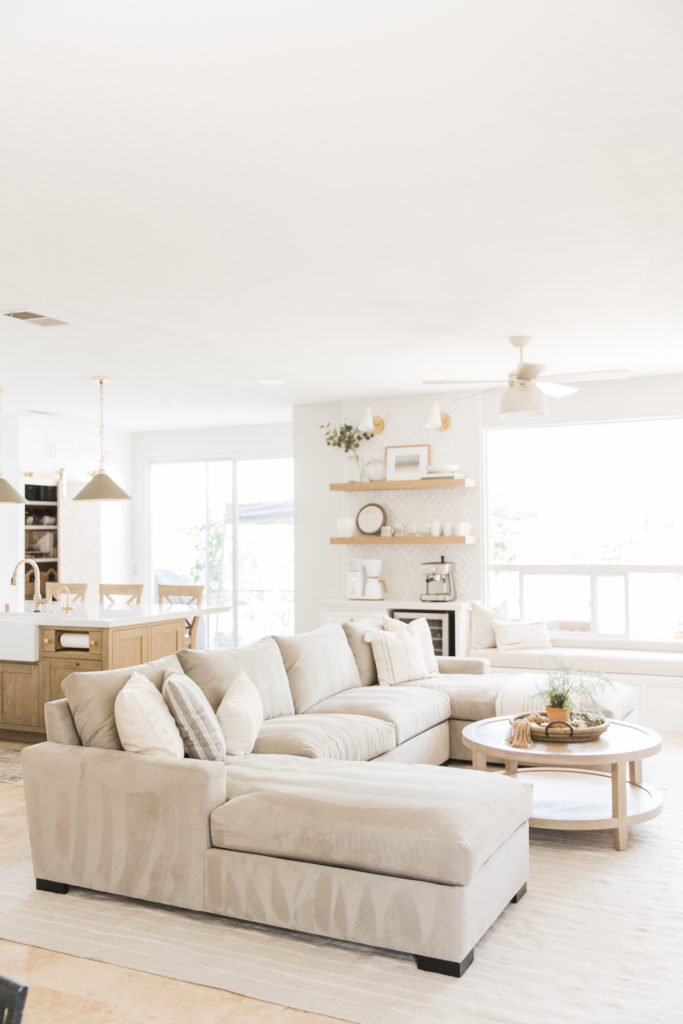
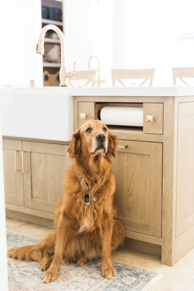
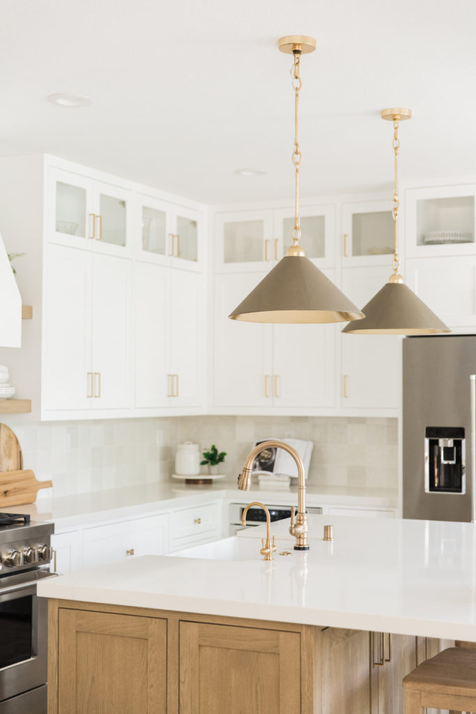
Our vision for this kitchen from the beginning was light and bright. My clients LOVE white..and they love airy and open…so we knew that was our starting point! Lots of white cabinets that go all the way to the ceiling to help give those ceilings a higher feeling. I always knew I wanted a warm kitchen island in here..so a white oak island in a custom stain was key. It took about 4 custom stain samples to get this right, and boy was it worth it. The stain is so warm and crisp without any yellow or pink undertones! Our finisher nailed it!
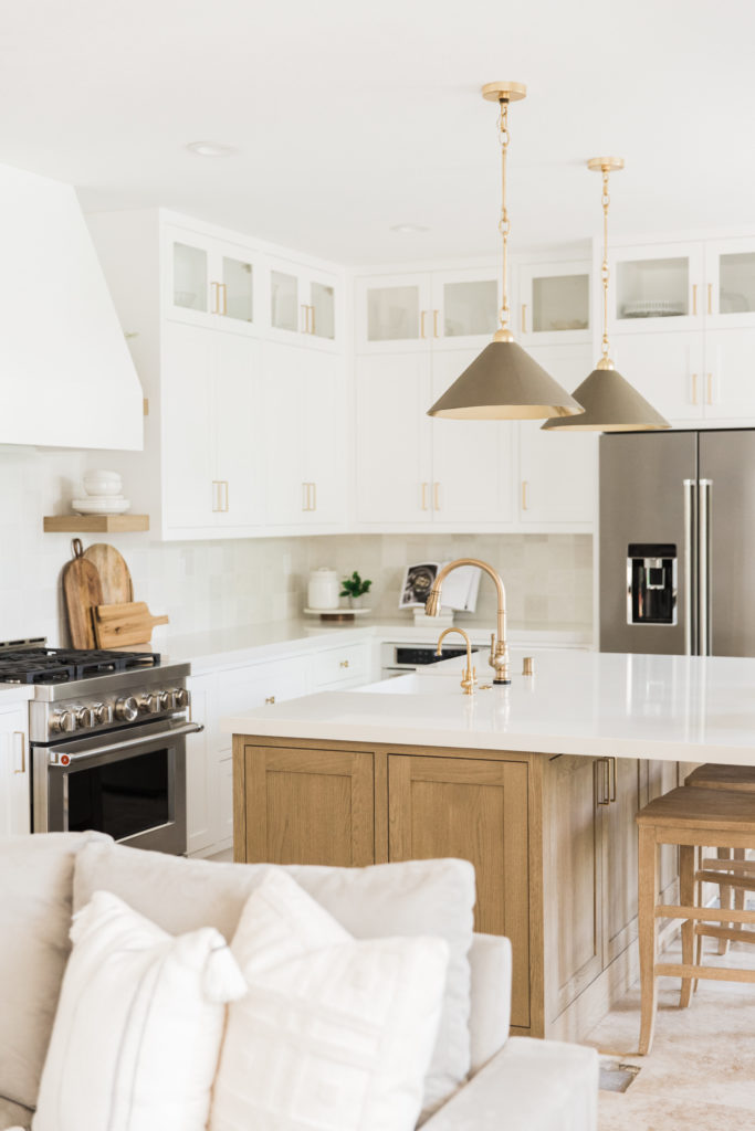
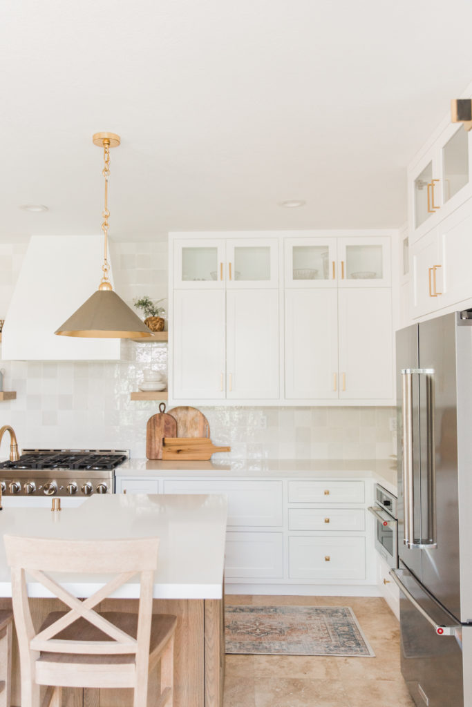
The countertops used were one of my all time favorites..we used a quartz from MSI called Calacatta Clara. The base of this countertop is a warm white and it has just some subtle veining running through. I did not want any countertops that pulled any gold tones or had any harsh veining to distract you from the rest of the elements.
The hood was designed to be a grand dramatic (but not in your face) look. I wanted something that had a little bit of detailing and a nice taper at the top. We flanked the hood with some floating shelves in the same wood tone as the island for a nice symmetrical look.
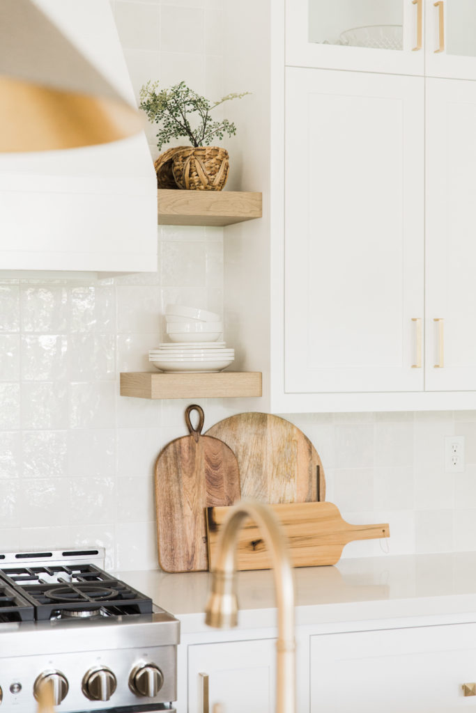
and it appealing to the eye
The lighting was the focal point of this kitchen. I told my clients when we were designing to be prepared to spend some money on the lights. These lights in both the island and the coffee bar are the statement pieces and the crown jewels to this kitchen. The cabinet hardware was the last layer and the simple lines on the pulls mixed with the warm brass tones lend themselves to the effortless backdrop.
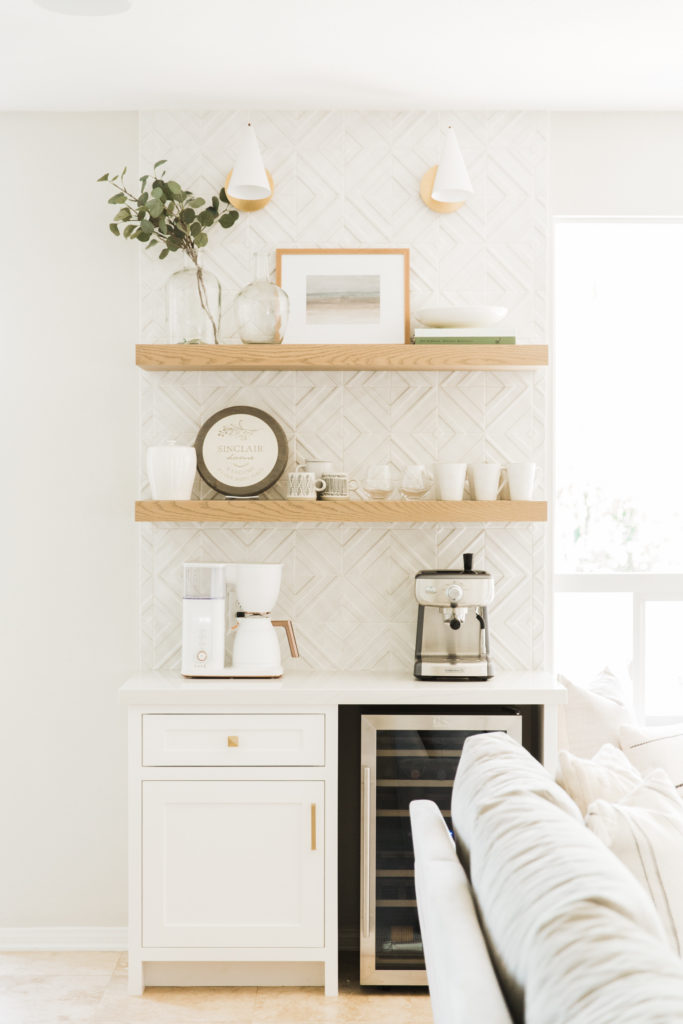
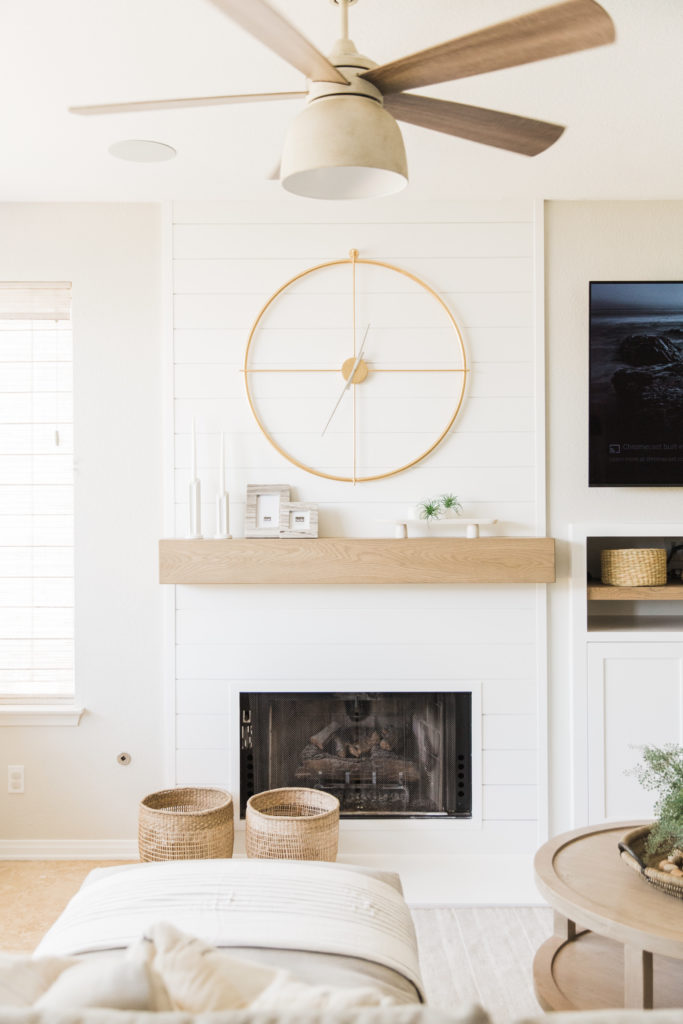
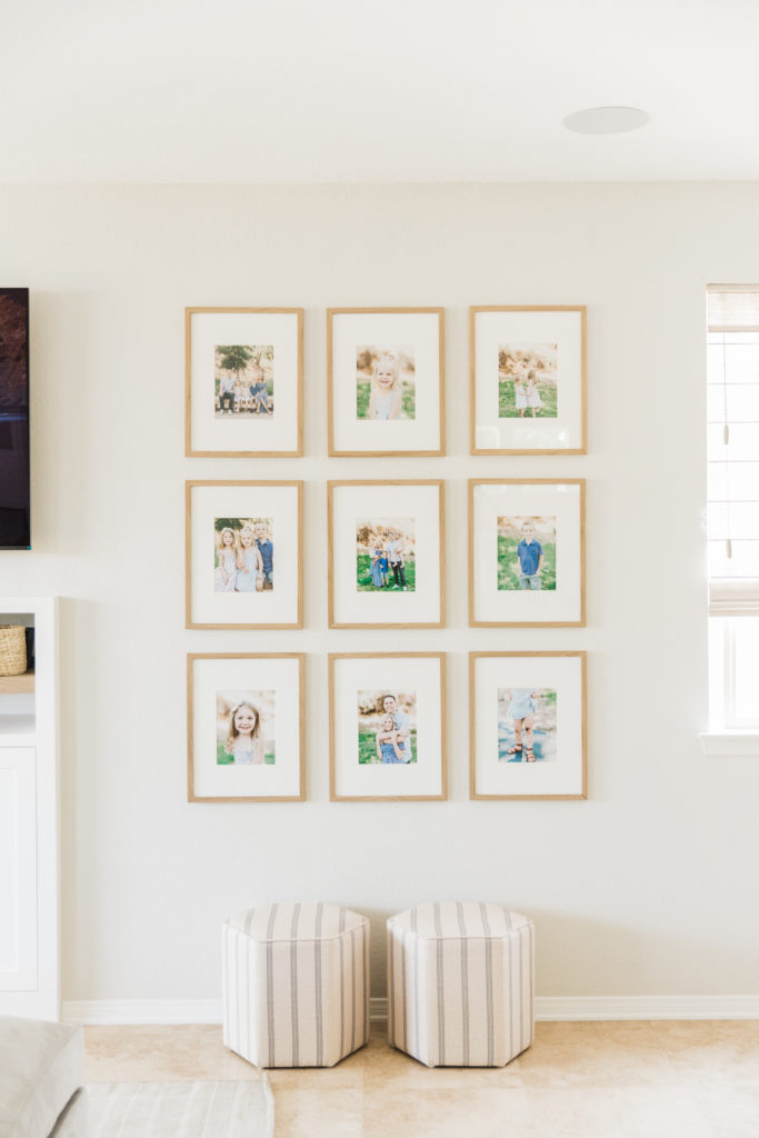
The family room and coffee bar are a continuation of the kitchen with the same light but warm tones and layered with textures! We carried the white oak from the kitchen over to the built in and mantel and found the perfect wall for a much needed gallery wall.
