March 29, 2022
Ok…the wait is over!The reveal of the entry way and guest bathroom is here, and I say it was worth the wait!
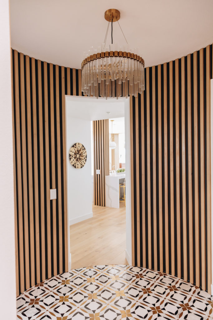
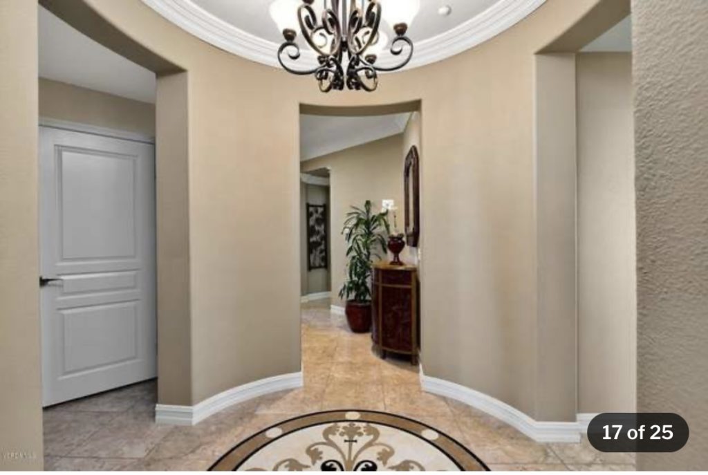
The entry way is a very dramatic space! The original entry was so boring. And while they tried to make it “grand” with a terrible chandelier and some out dated flooring it needed something special. This entry isn’t large by any means..but that doesn’t mean we can’t pack it with a punch! Our goal was to get people to say OH MY GOSH when they walked through the front door. All while keeping the same feel as the rest of the house. This is where the the wood slat design originated! But we didn’t stop there..to give more of a pop we added a black wall behind the wood slats to make them stand out that much more. This crystal chandelier is the modern take on a traditional crystal chandelier, with the brass detailing and the tubular crystal design. And then we get to the floor..the floor is a marble with brass inlay floor tile that has a very striking and pop design. I think we nailed that OH MY GOSH look!
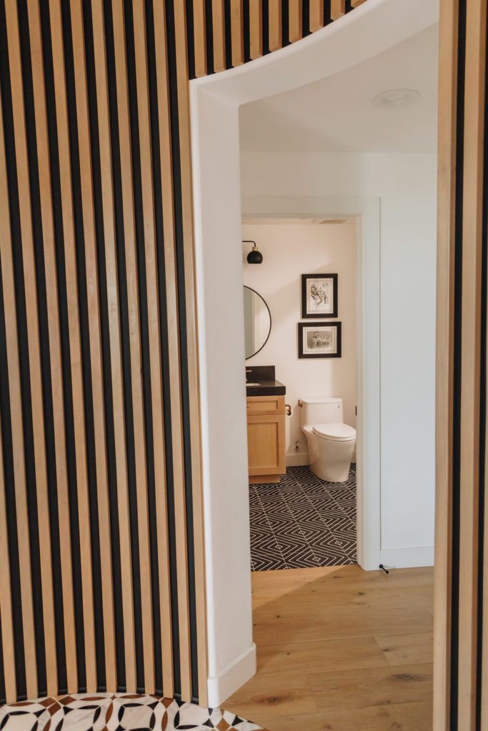
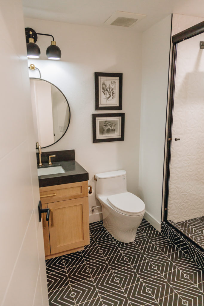
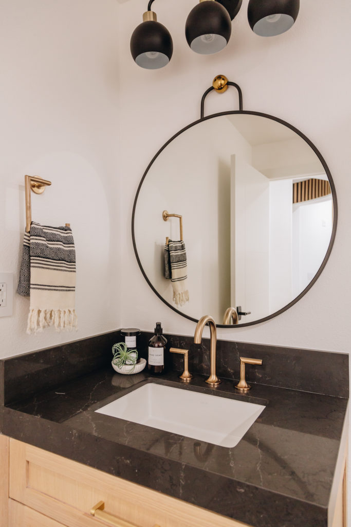
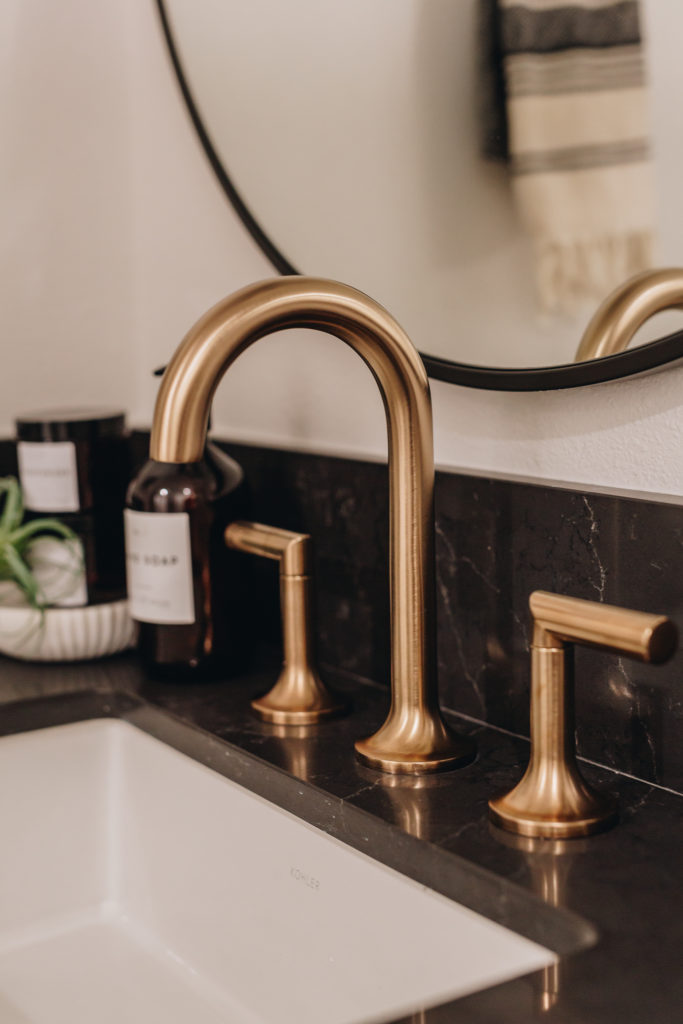
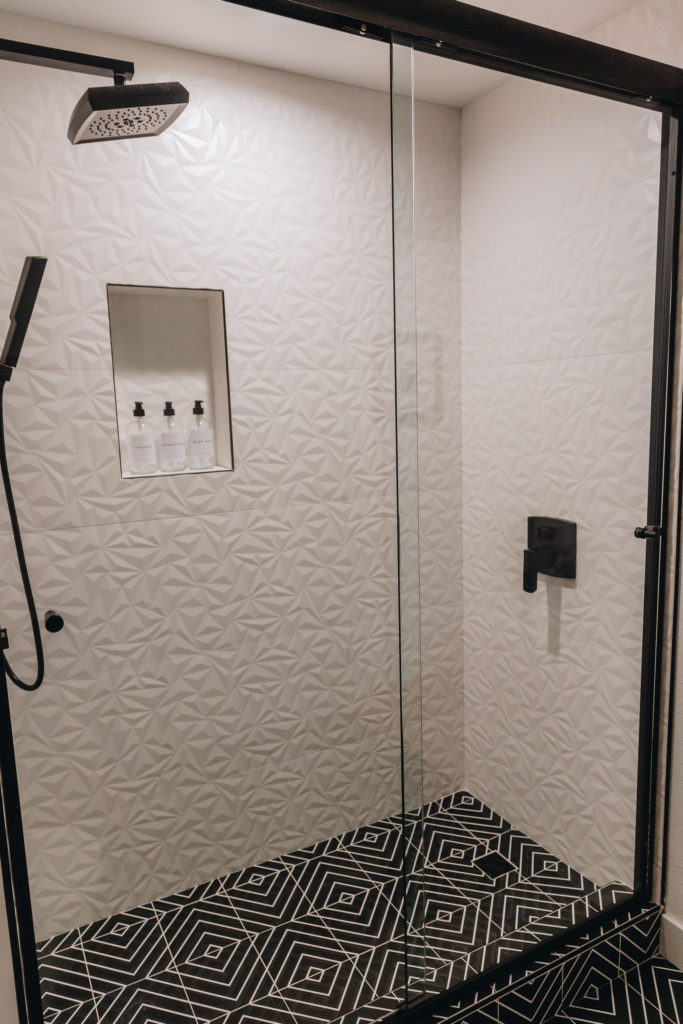
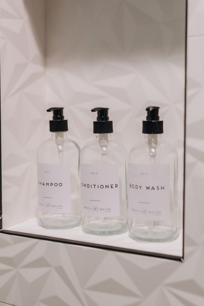
As we enter the guest bathroom..we have a modern black and white geometric floor with the same white oak cabinets as the kitchen area. Brass and black fixtures play off each other so effortlessly in here! The 3D shower wall tile is so classic yet so fun! Layers and layers of textures was the name of the game in this bathroom….and see you can do 2 different patterns, white oak, mixed metals and it can still work, all without being too much!
Stay tuned for the final reveal of the bedroom and bathroom coming VERY SOON!
