July 13, 2022
Our Durant Project is a definite fan favorite! You guys have LOVED this project from the moment we showed it! This project consisted of a kitchen remodel..but we packed A LOT of goodness into one kitchen, and were here to talk about it!
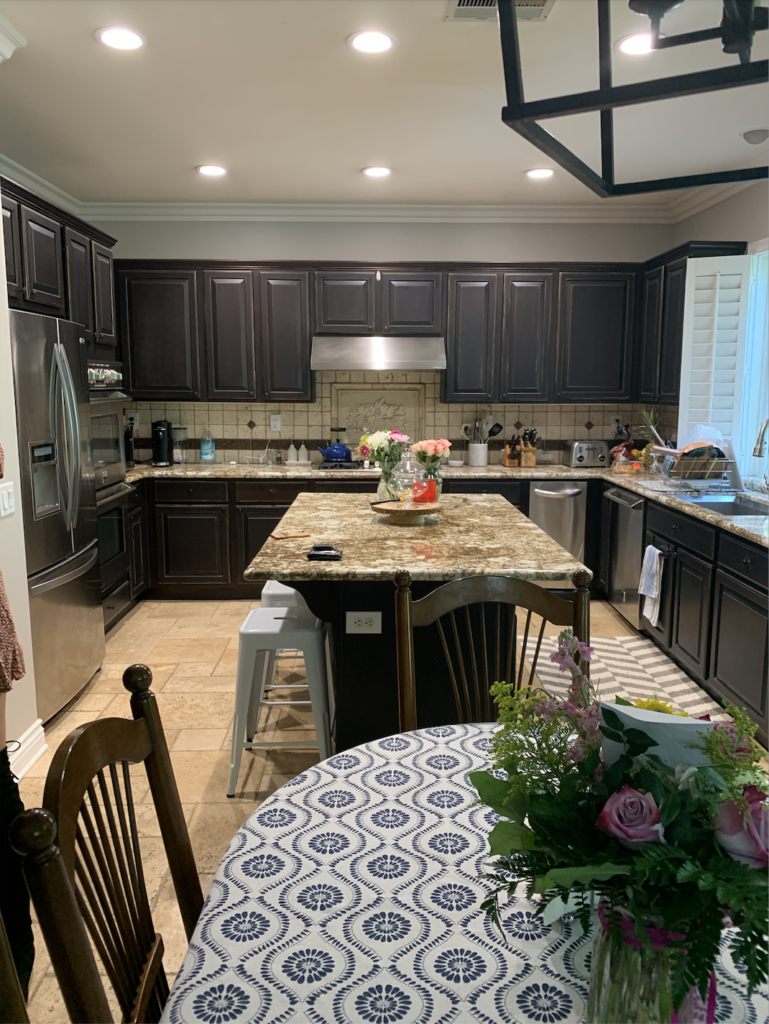
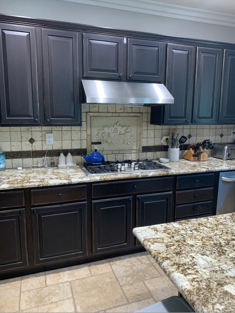
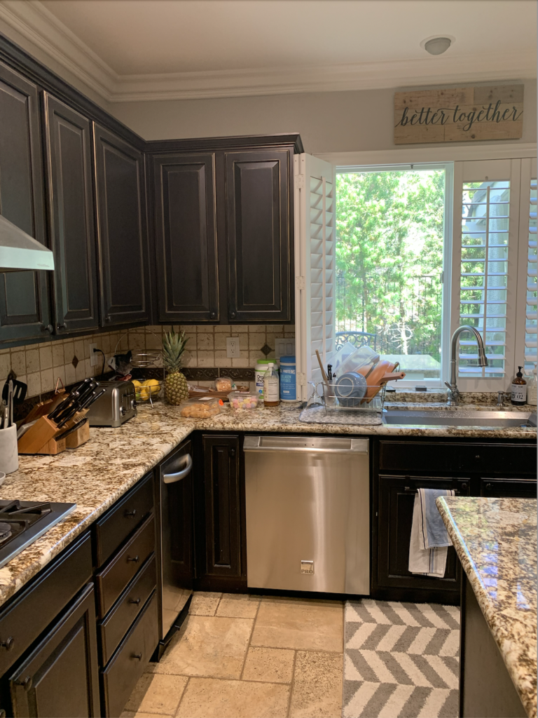
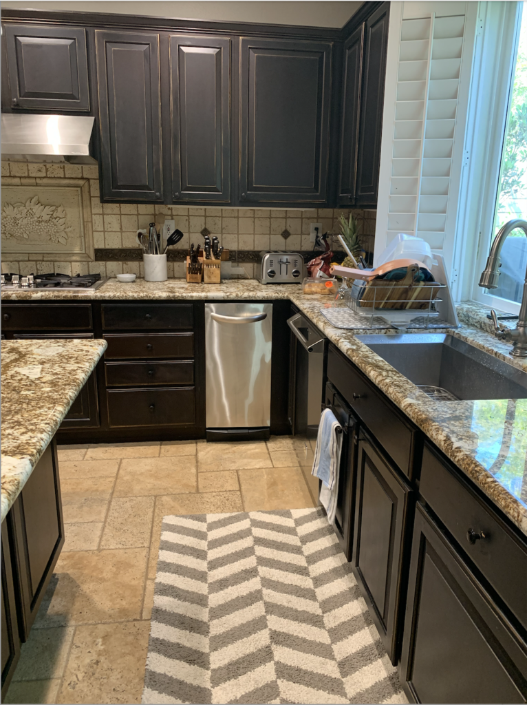
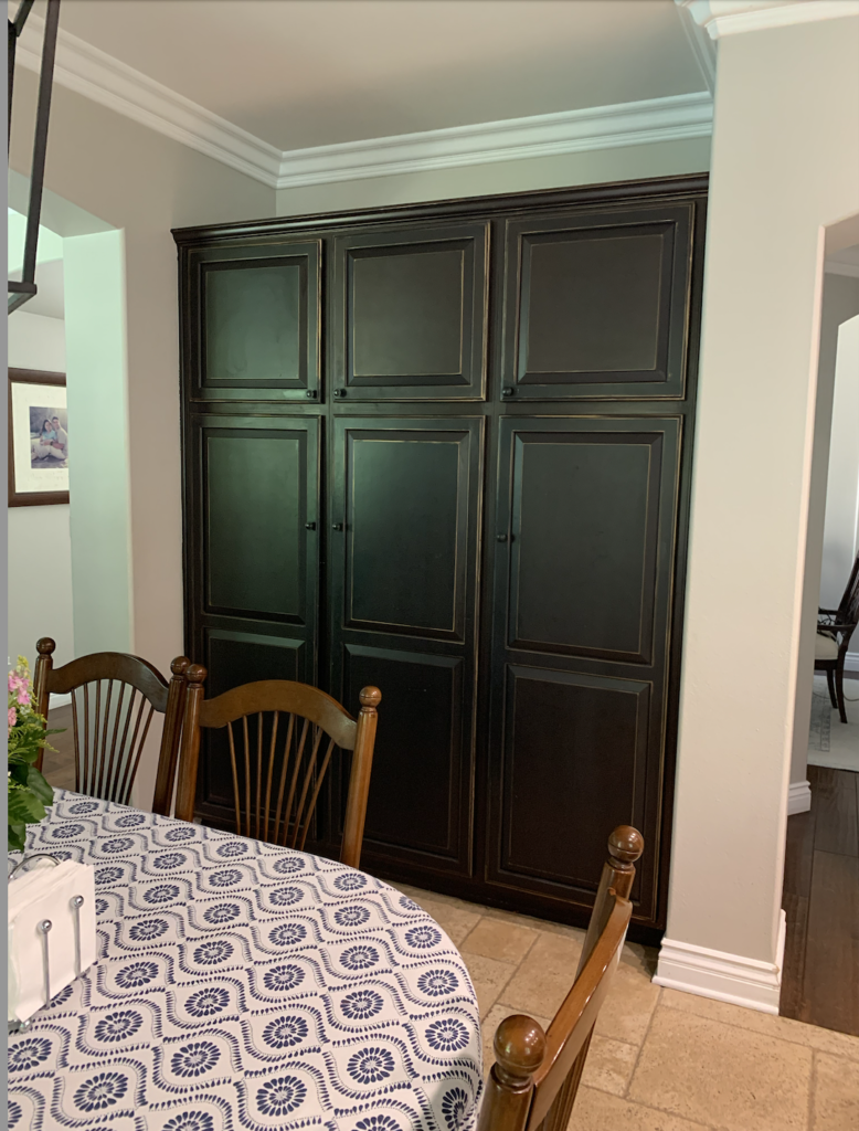
This beauty started as a dated and dark builder kitchen. In typical builder fashion, the cabinets didn’t go all the way up to the ceiling, the fixtures were all outdated, and we had some very brown countertops and backsplash. The moment we met with the client I knew the potential for this kitchen would be truly amazing!
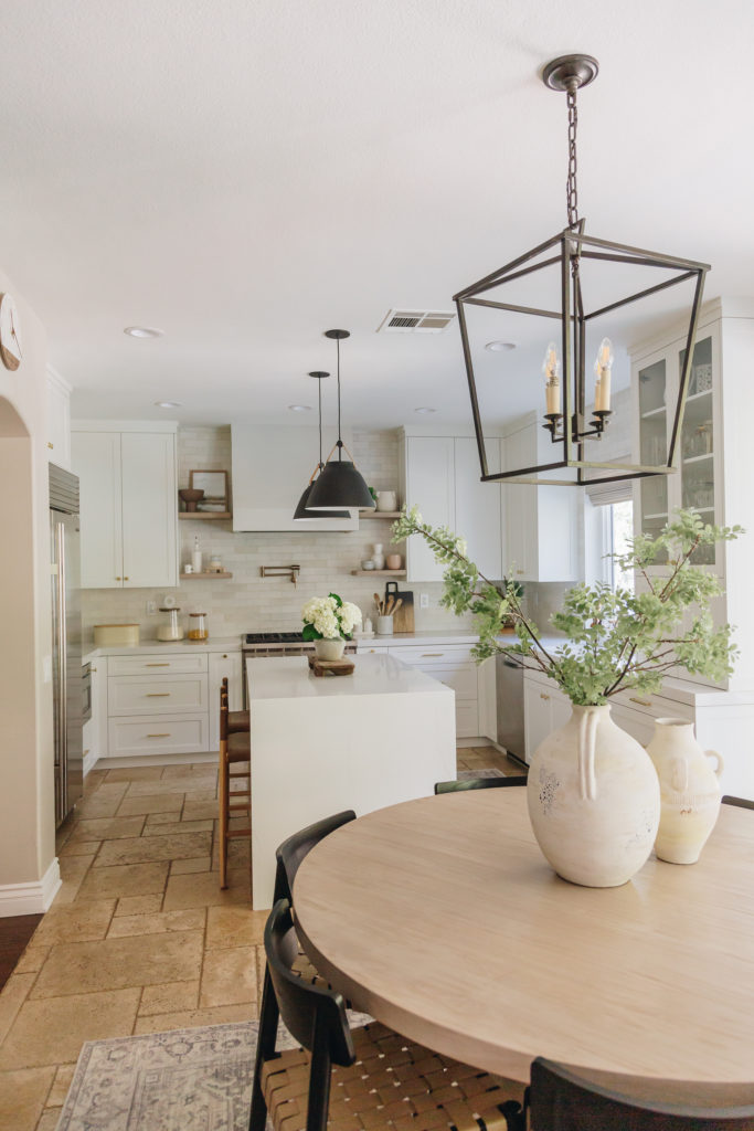
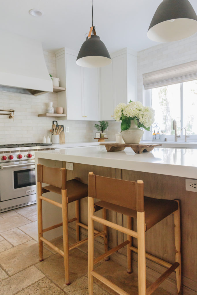
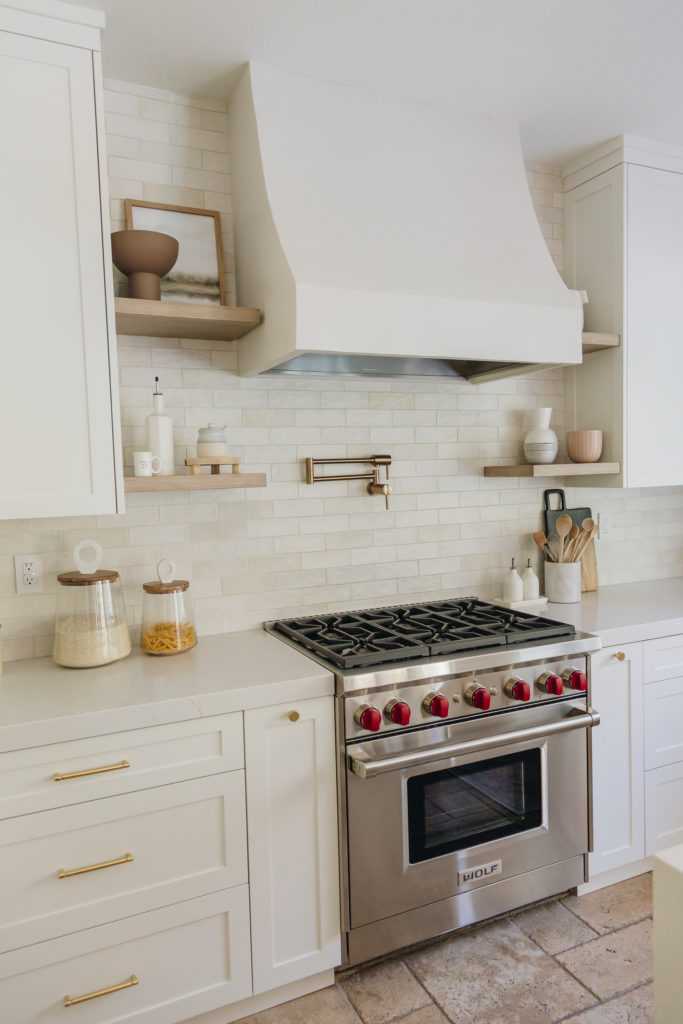
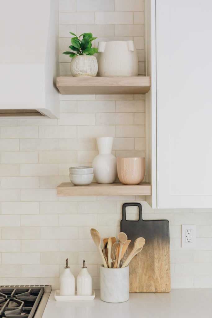
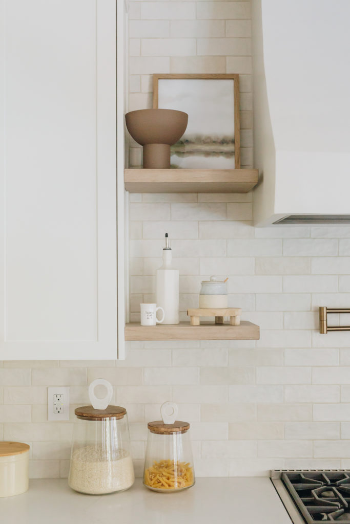
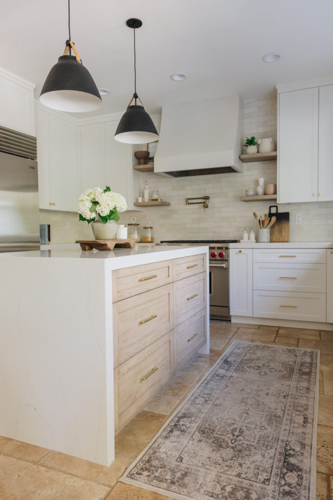
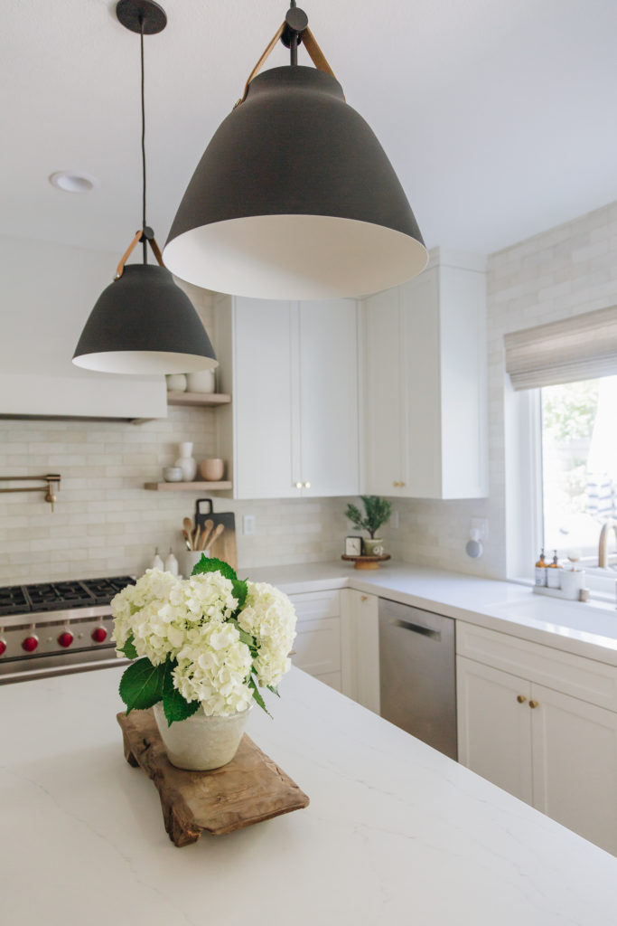
We knew immediately we wanted a hood moment..we wanted to break up the long row of cabinets on the back wall and have a gorgeous hood. We also knew floating shelves were a MUST flanking the sides of the hood. We did a plaster hood in a very soft gray and some light wood stained shelves. Look how balanced this wall looks now. The cabinets are a pure white and go all the way up the ceiling like they should have all along!
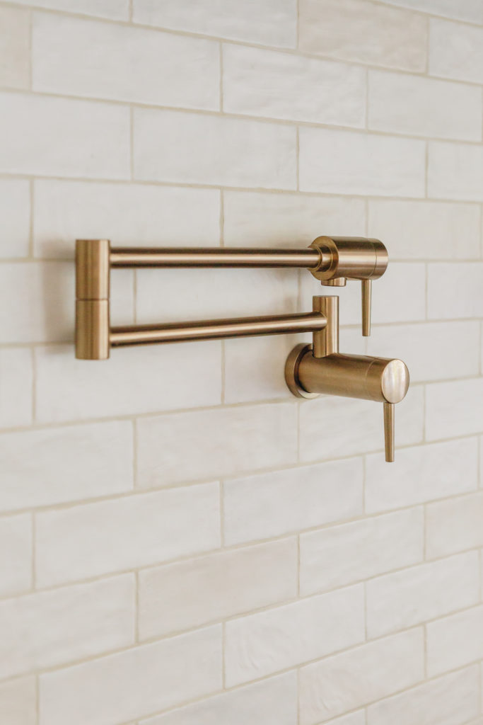
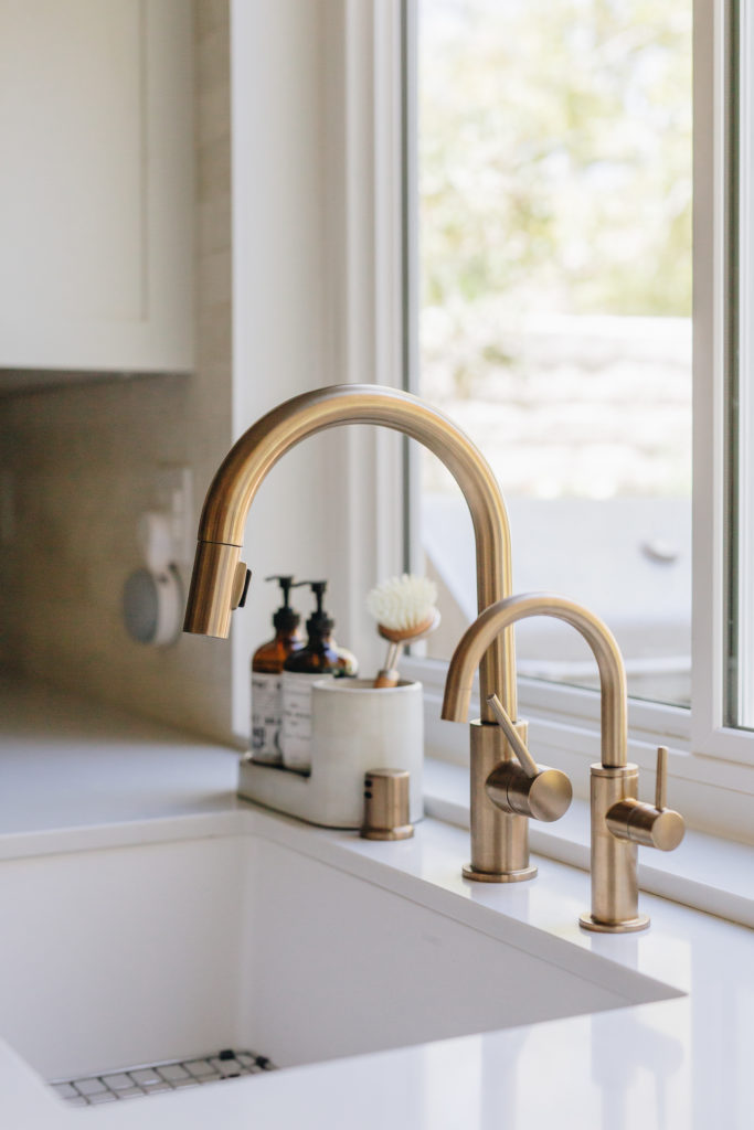
We wanted another moment around the window. When we were designing we came up with the idea to do an appliance garage on the one side of the window and also some storage for all the entertaining glasses, since that was right by the back door. The “drawers” below the appliance garage are actually beverage drawers that are insulated so it keeps all the drinks cold! Perfect for all the outdoor entertaining this client does! We continued the matte subway tile around the window for a WOW moment! This tile is an RRI favorite as each tile is just a little different and they all vary in color for a more natural look.
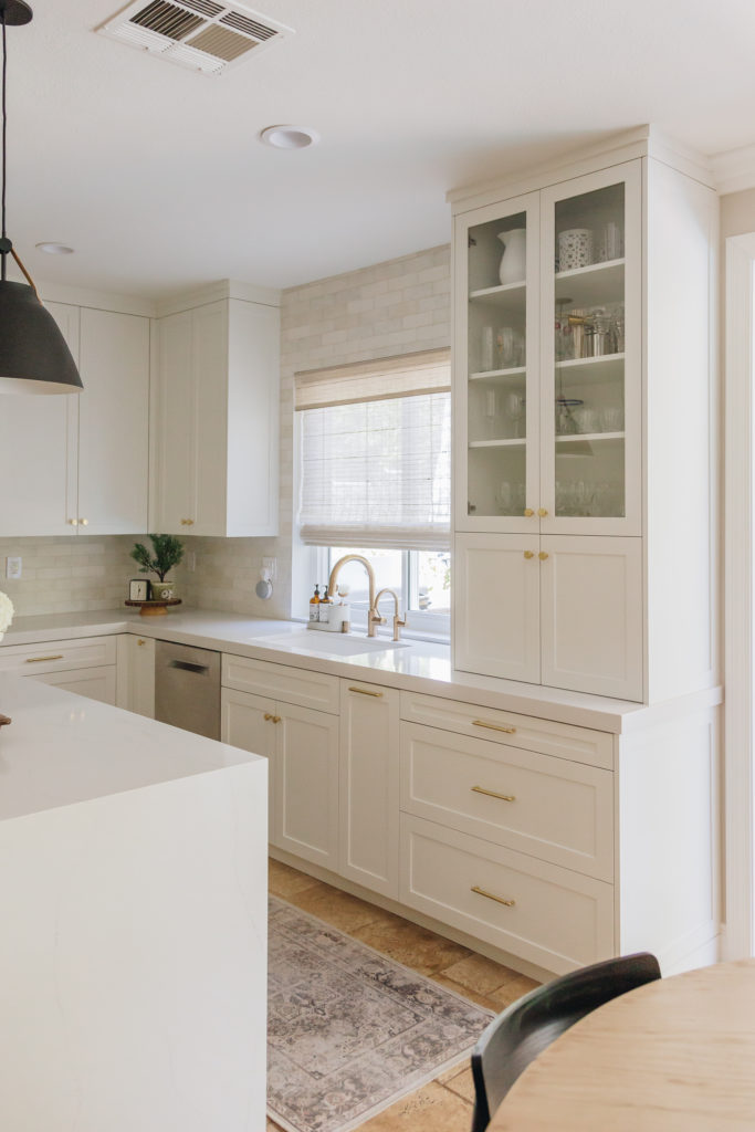
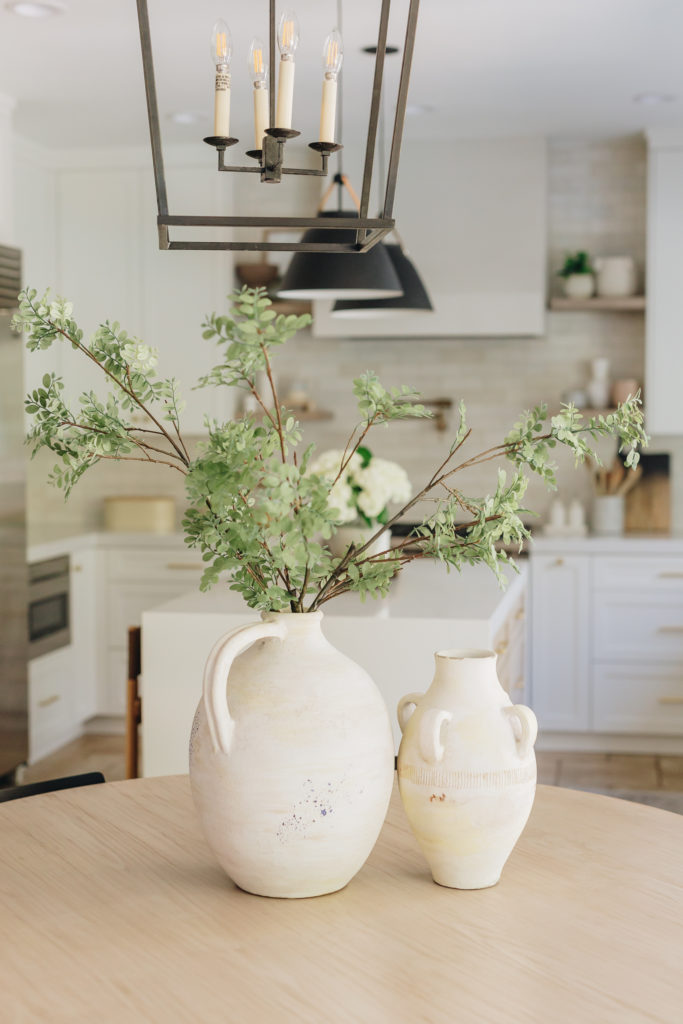
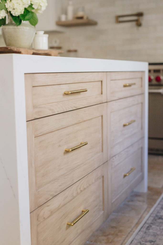
The island we couldn’t really change in size, as we were not moving any walls, but we did get to add waterfall sides for a more dramatic look, and this island has a contrasting custom stain color that was created on site (i know you will all be asking what stain this is). This pairs perfectly with the floating shelves we used around the hood. And can we talk about the breathtaking black and leather pendent lights! Yes please!
Pro Tip: Don’t bring too many stain finishes into a kitchen. For a more cohesive look we like to use the same stain finish throughout the space!
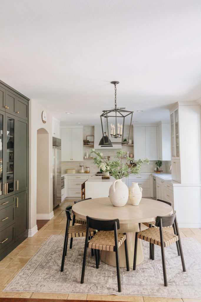
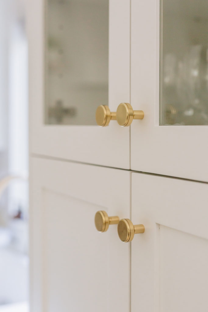
Lets talk about this pantry..this pantry is what dreams are made of! No, really! They have closed storage for everything you don’t want to be seen. Big snack drawers for easy to grab snacks, and some glass doors to break up the wall of cabinets and to show off some of the beautiful dish-ware this client has! We also popped in a dark accent color to break up all the white cabinets! And that brass hardware just finishes it off so beautifully!
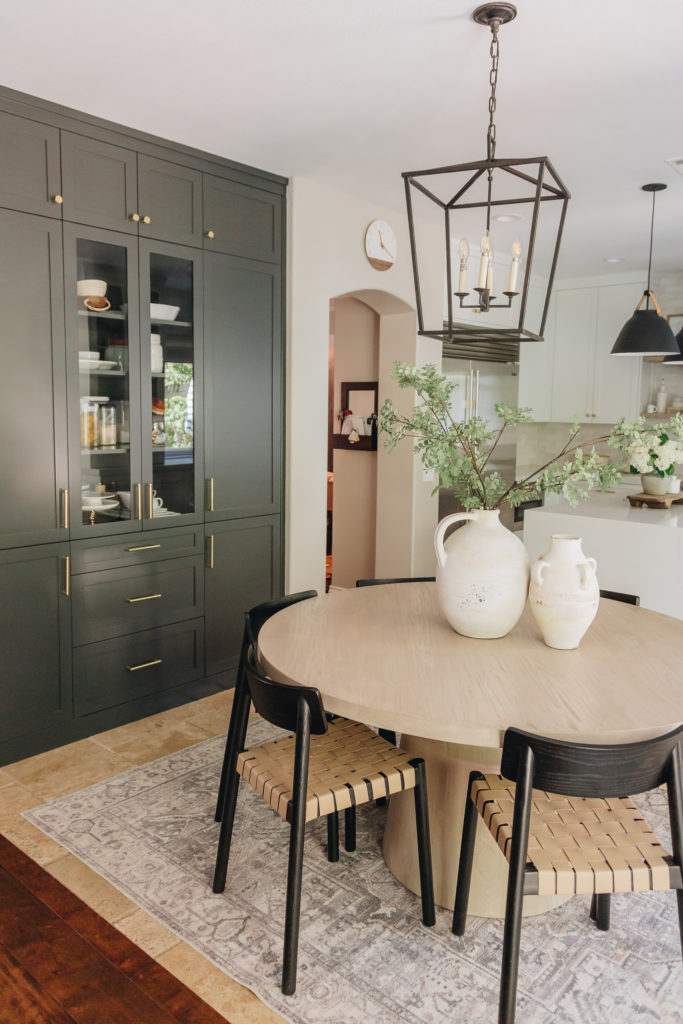
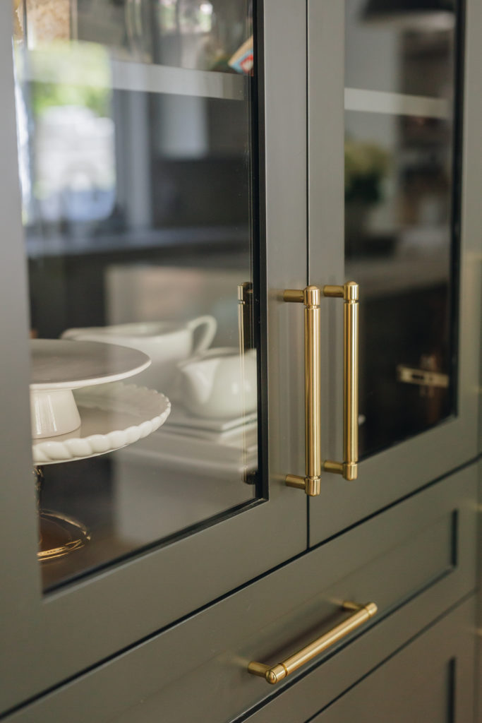
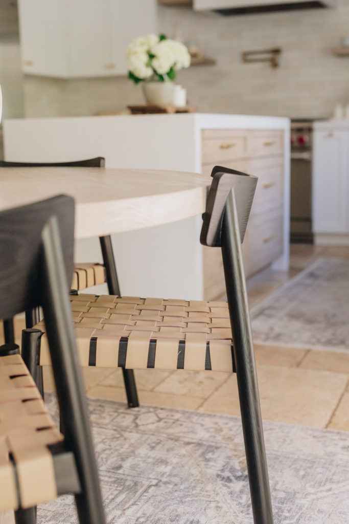
The black and brass accents help finalize the textures and tones used throughout this space! I can see why this is one of your guys’ favorite kitchens! Its one of ours too!
