August 31, 2022
accessories, Built Ins, home design, interior design, Light Fixtures, neutral, Playroom, remodel, Wallpaper
When you think playroom…if you are like me you immediately think toys everywhere…total disarray…not a place that any designer wants to see downstairs..BUT it is a place that is totally necessary when you have little kids. It is a place that builds more than just memories. AND….best of all…it can look beautiful too!
Our playroom our our Sterling Project was once a GORGEOUS dining room (that yes…was designed by RRI).
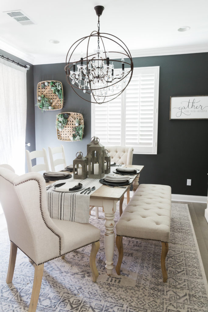
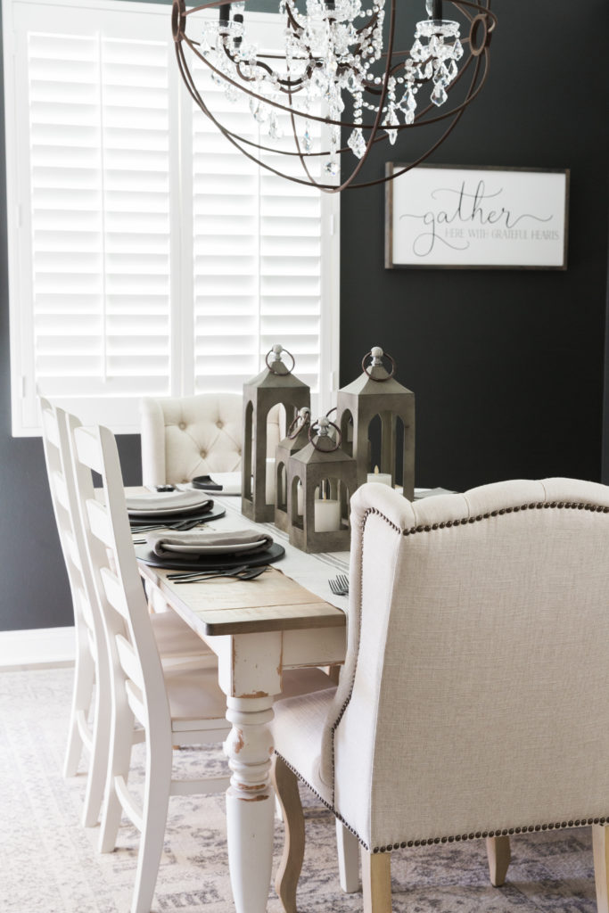
However, it was also a space that was often never touched. When my clients started a family and kids toys were everywhere, it was the only place that made sense, in their very open floorpan, to put a playroom. And the moment my client told me what she wanted to do…I was completely on board! But I knew we needed to do it right so it wasn’t just any old playroom. I wanted built ins to hide the toys, baskets for easy cleanup, and some great other elements to transform this space!
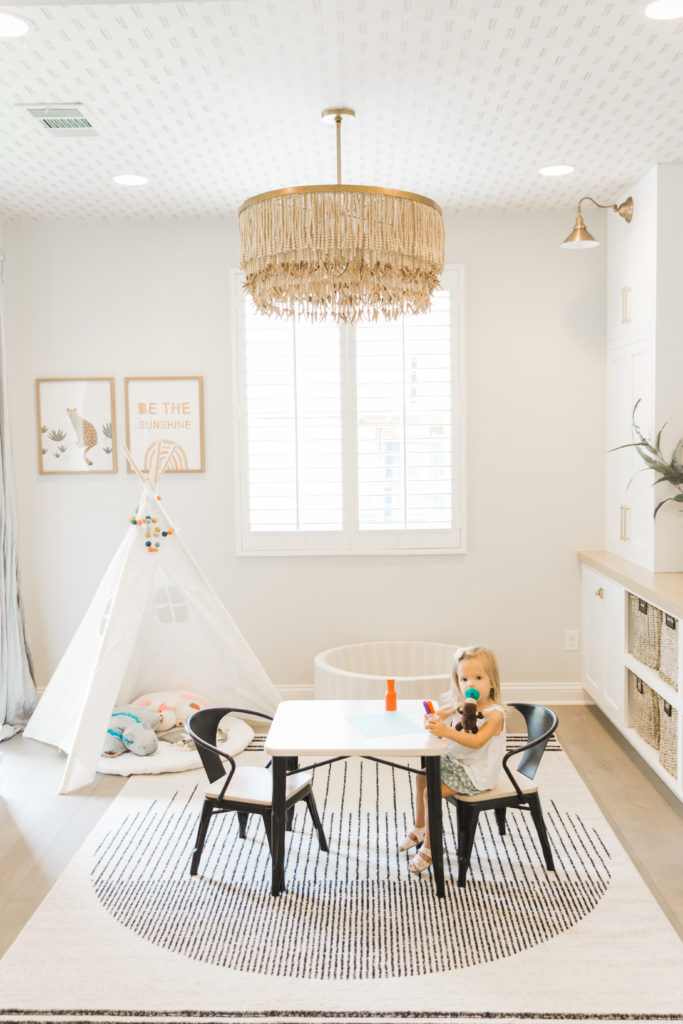

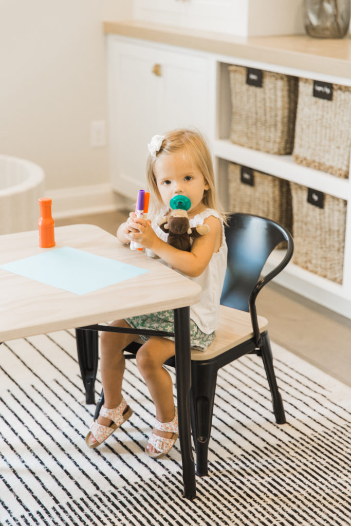
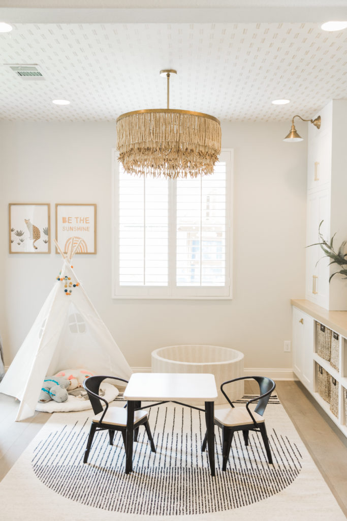
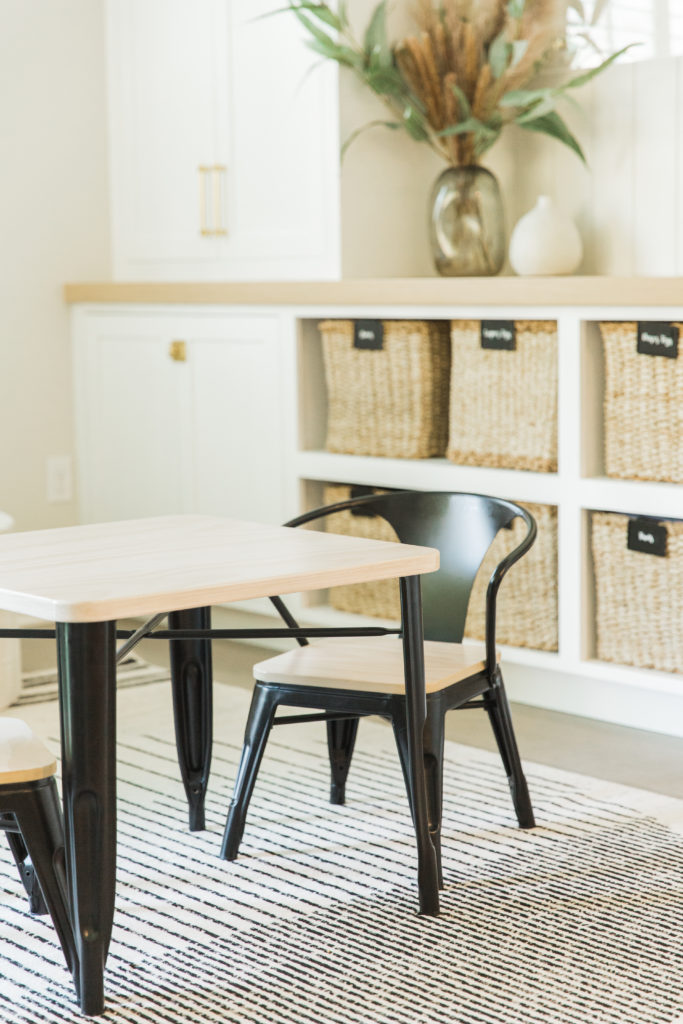
First thing was creating the built in designs to be 100% usable for my clients. They wanted both closed storage for the everyday arts and crafts and for the things that she doesn’t necessarily want visible. But she also wanted baskets for all the toys that the kids can easily pull out, and the parents can easily put away! I knew I didn’t want this space to be dark and moody like their old dining room. We landed on the white cabinets with the light wood countertop that runs across. This helps break up all the white and bring in some much needed warmth. We already had the light wood wide plank floor that runs in here. Also, because this house has wood paneling throughout, we added the tongue and groove shiplap behind the built in to tie it all together. We lighted up the walls for a very fresh and light feel.
Wall Color is Sherwin Williams Drift of Mist
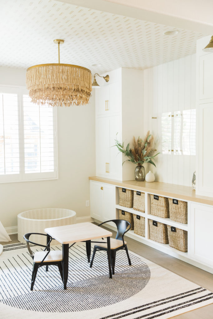
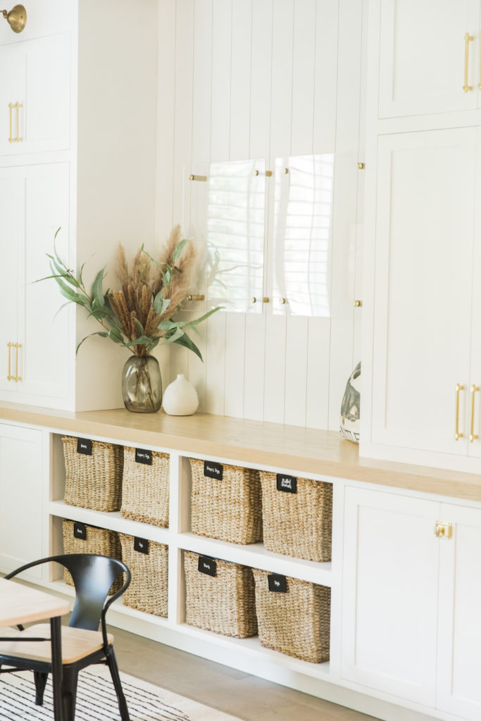
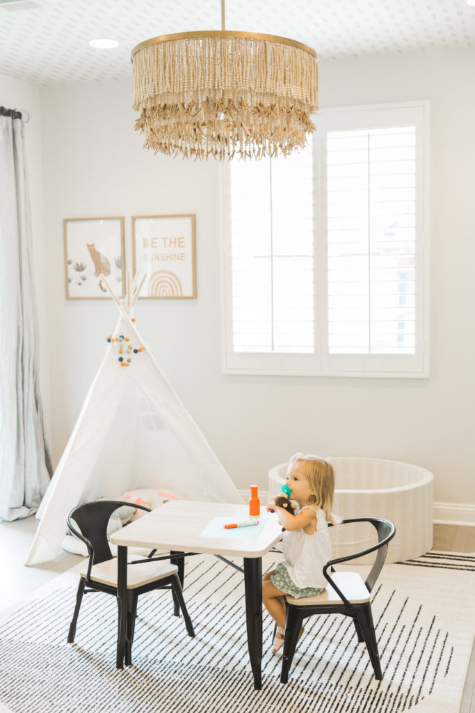
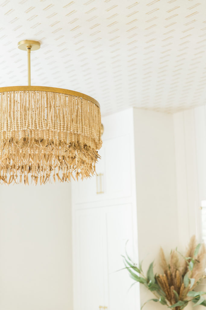
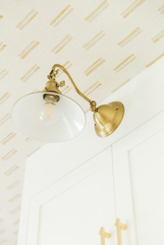
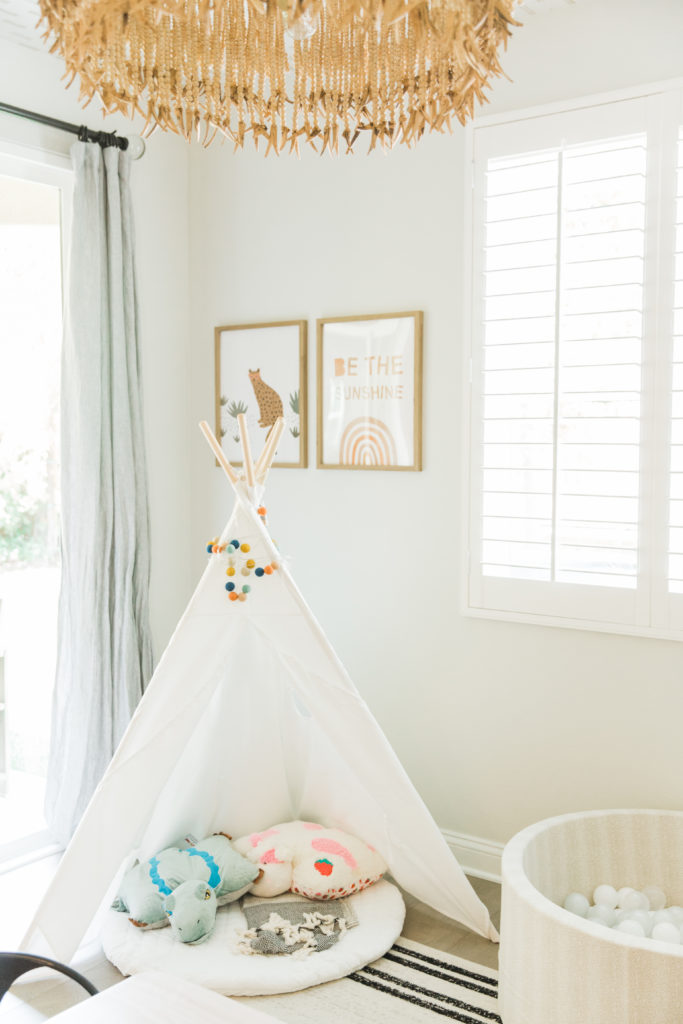
Again, because this is a playroom, we wanted some fun elements too. We added this simple wallpaper to the ceiling, and this very unique brass and beaded chandelier, and some more vintage looking sconces to the built ins. Seriously, imagine this space without those 3 elements, it would be so flat looking.
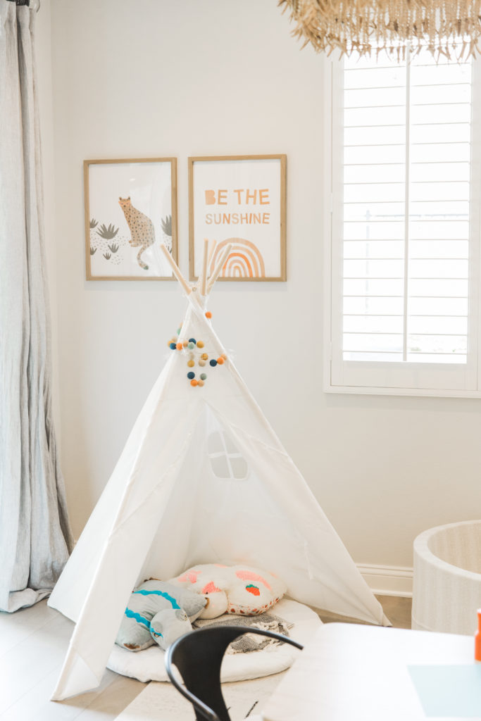
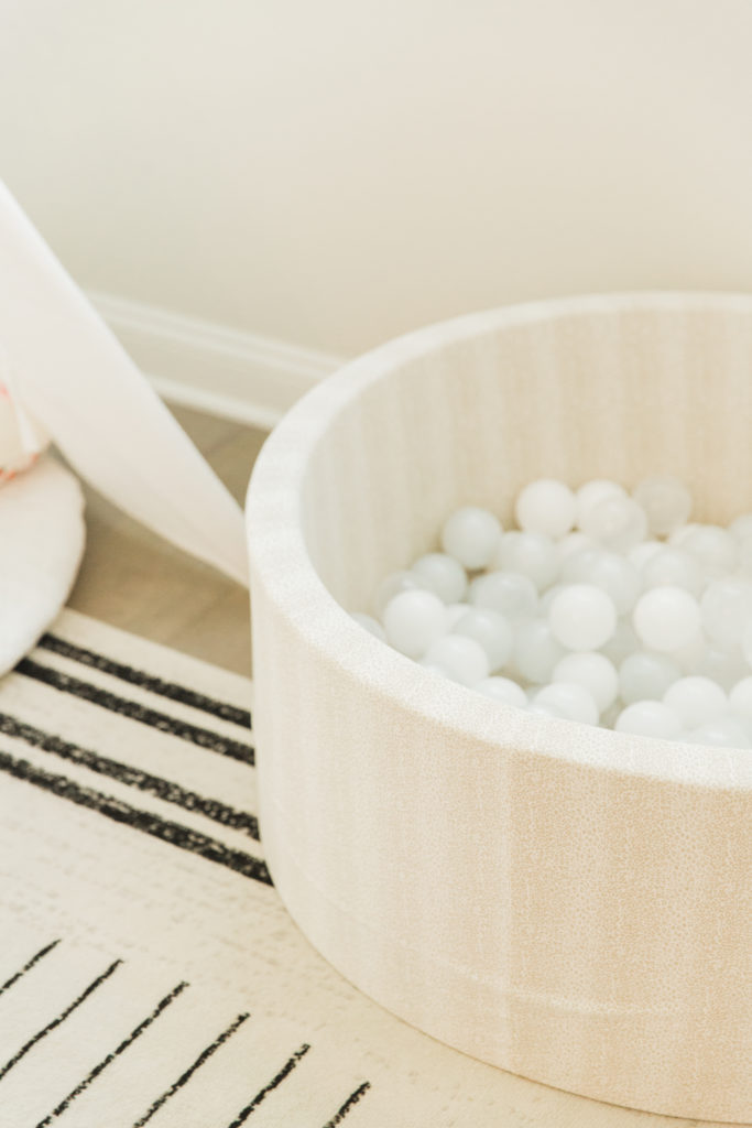
We finished it off with a playful rug, of course a black and wood kids table and chairs (that they use all the time) and a cute little tent that they look at books in! Oh, and a ball pit..what kid doesn’t love a ball pit!
This room is not only beautiful but it is also functional. That was the key to this space, and the kids absolutely love to play in here…and the parents absolutely love that their toys are not sprawled out all over the family room!
