December 6, 2022
accent walls, accessories, earthy colors, family room, Game Room, home design, interior design, kitchen, kitchen accessories, Light Fixtures, neutral, pattern tile, remodel, textured walls, textures, tile, white oak
One of the most loved spaces in a remodel is always the kitchen/family room areas. Strictly because they are the heart of the home, the most lived in parts of the home! So we are always very specific when designing these areas.
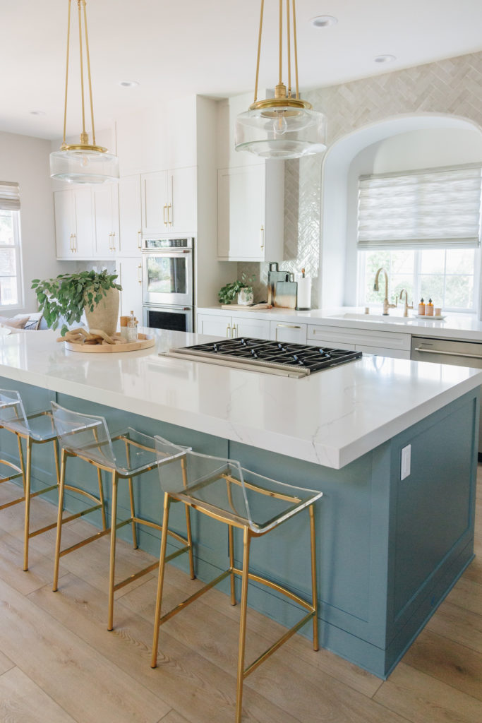
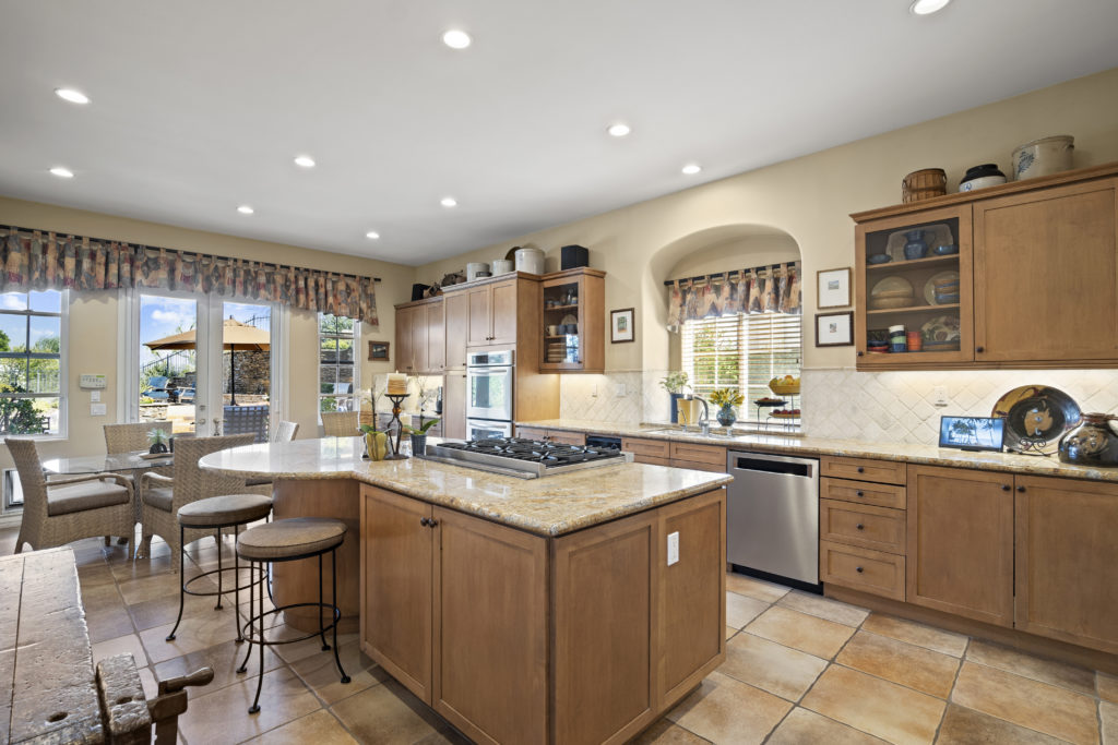
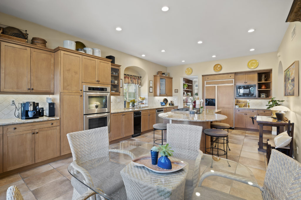
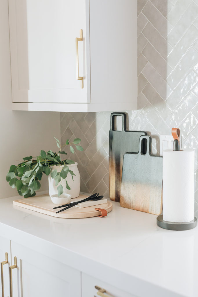
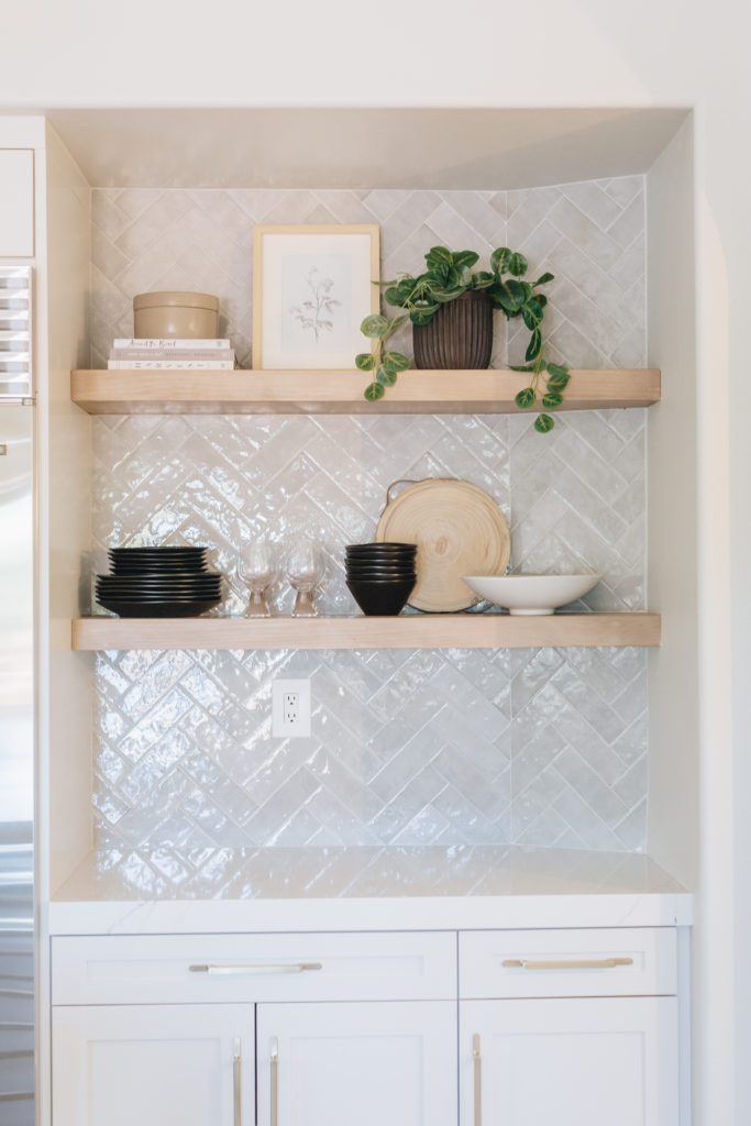
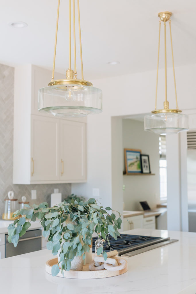
When designing this kitchen, first thing first, the island needed to be squared off and made more functional. We needed some light fixtures in here to bring in some different textures. And some of the old cabinetry designs needed to be replaced with some floating shelves to break up all the walls of cabinets. The door and drawer fronts were replaced from the old raised panel designs to a more modern shaker style detail.
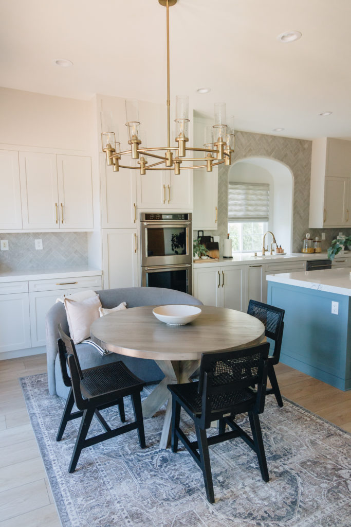
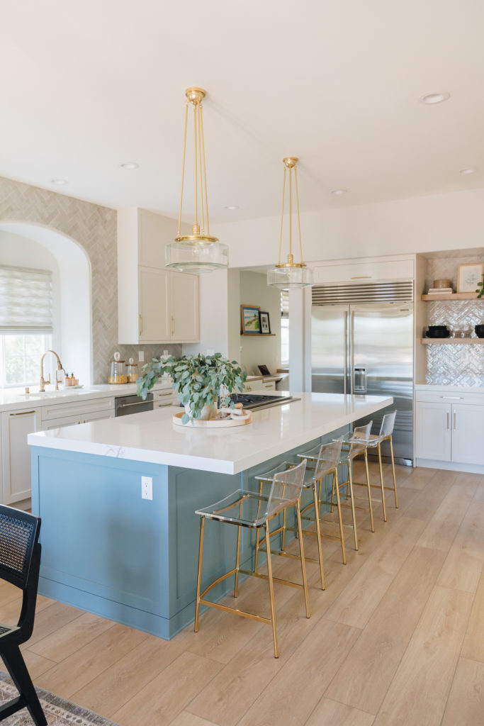
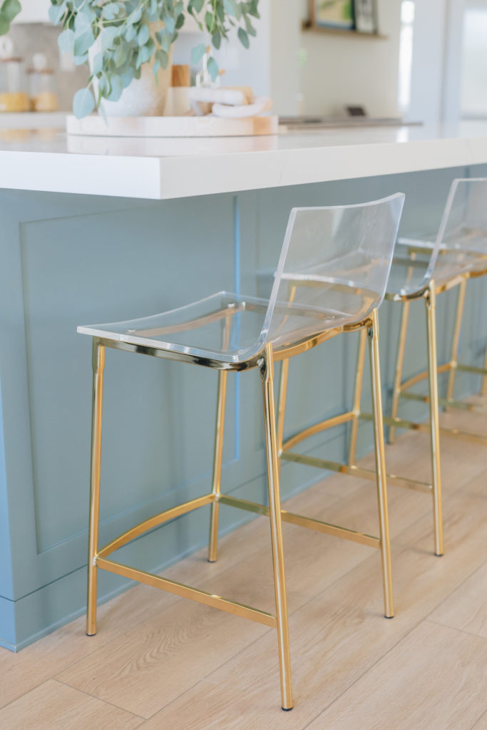
My client wanted to bring in blue tones throughout, that was really their only request. When using a color in a kitchen, we use it in small doses. We popped this blue on the island which was the perfect accent. We also carried this color into the laundry room and “mudroom” lockers just right around the corner. One of our favorite quartz countertops is MSI Calacatta Clara so of course we used that in here. What I love about this countertop is it has a muted and creamy (not stark white) background and a very light veining throughout. On the rest of the cabinets we brought in a “Greige” cabinet color (Drift of Mist). The gray natural tile that was laid in a herringbone pattern was the perfect backdrop for these other materials. Then you add the accented gold finishes in here and it really is the most California Causal space you have ever seen!
This floor-plan layout did not have a direct entrance from the kitchen to the family room. Odd right! We ripped out the old built ins in the family room and opened up these arch ways so you can see directly into this gorgeous space from the sofa. It really opened up this entire living space! The original fireplace was old and dated. I knew we needed a bold tile to carry your eye from the outside beauty to this new focal point. The fireplace. We brought in a marble “pattern/not pattern” tile, paired it with a floating mantel in a warm wood tone, and tongue and groove wood planks right up to those tall ceilings.
Oh and did I mention, we ripped out those 3 individual doors and replaced it with a wall to wall stacking door, to give the true inside/outside living.
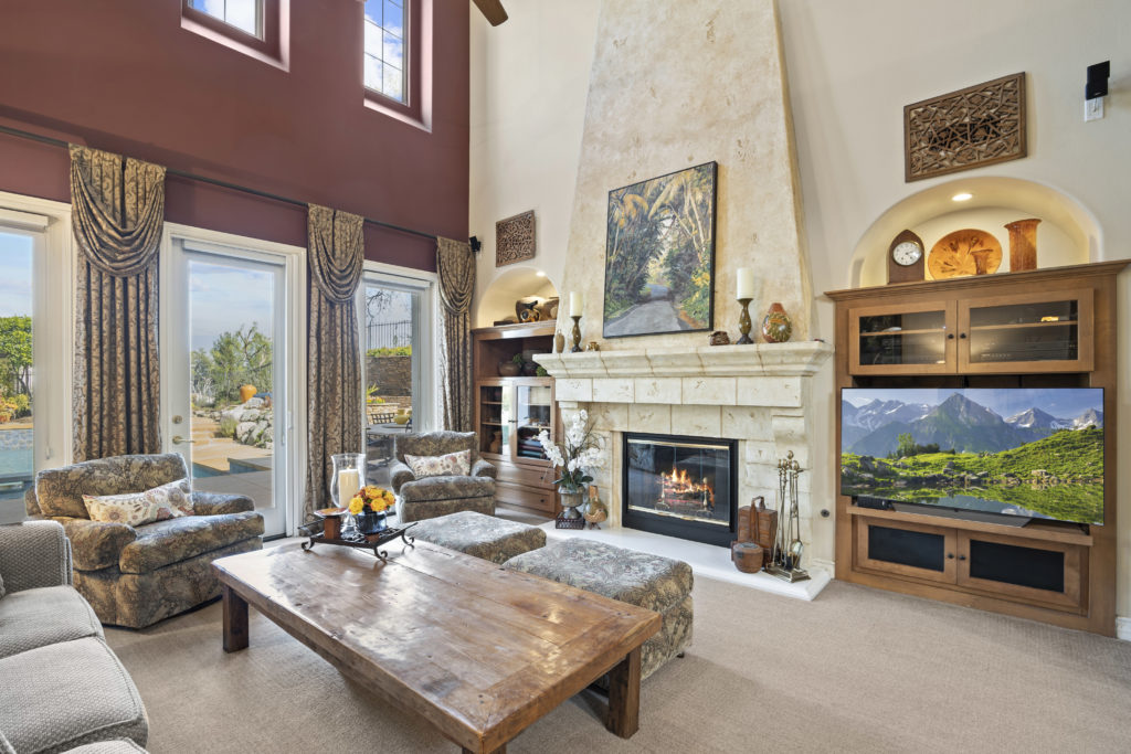
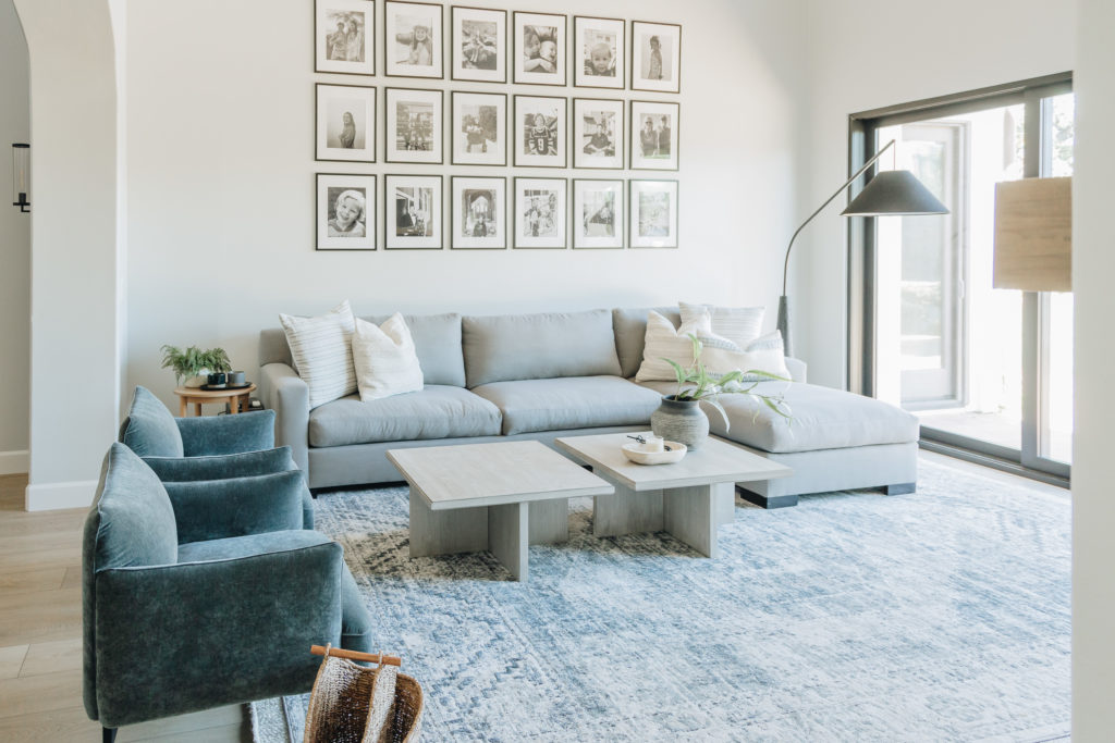
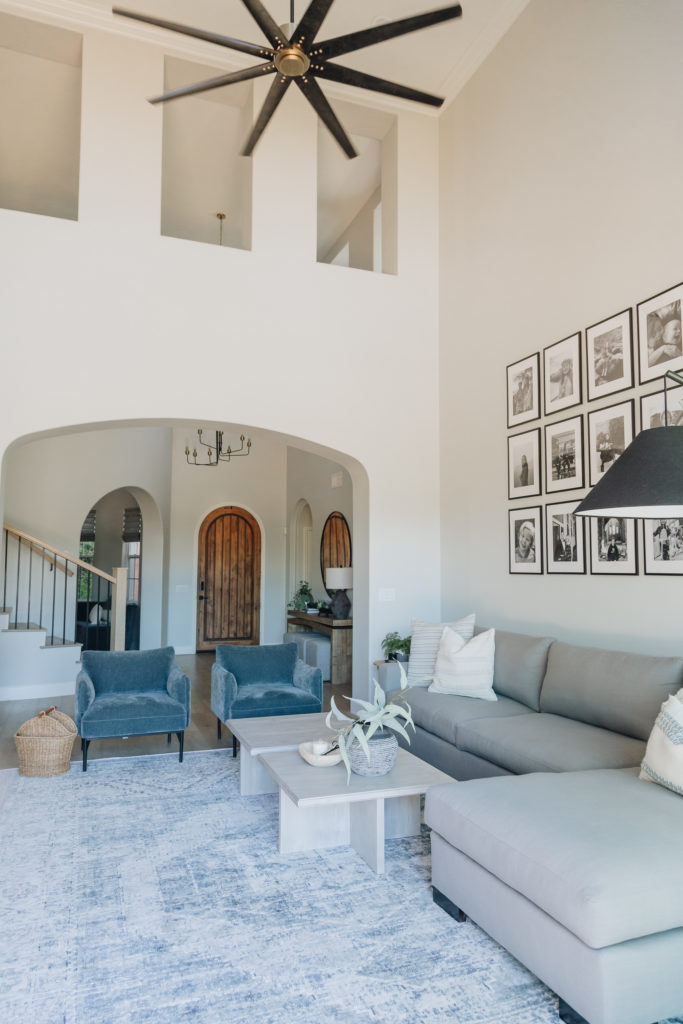
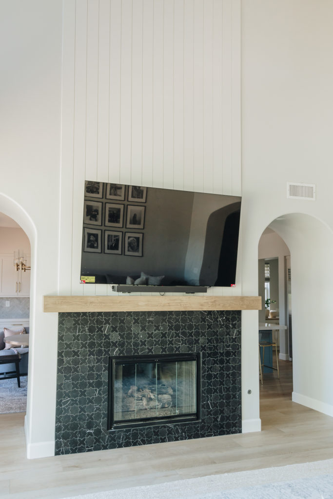
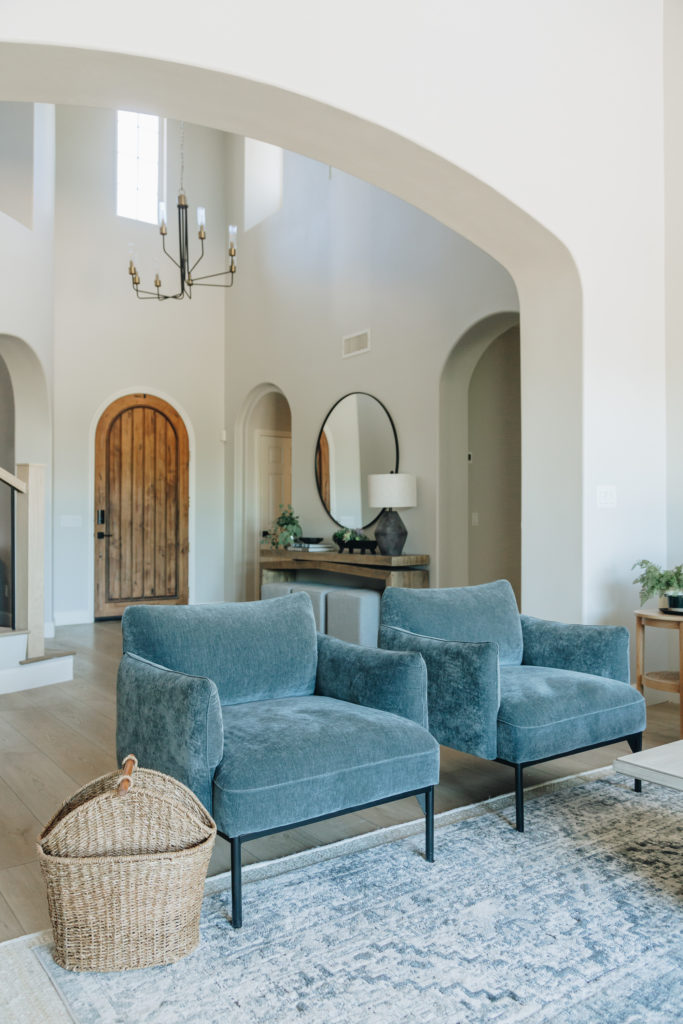
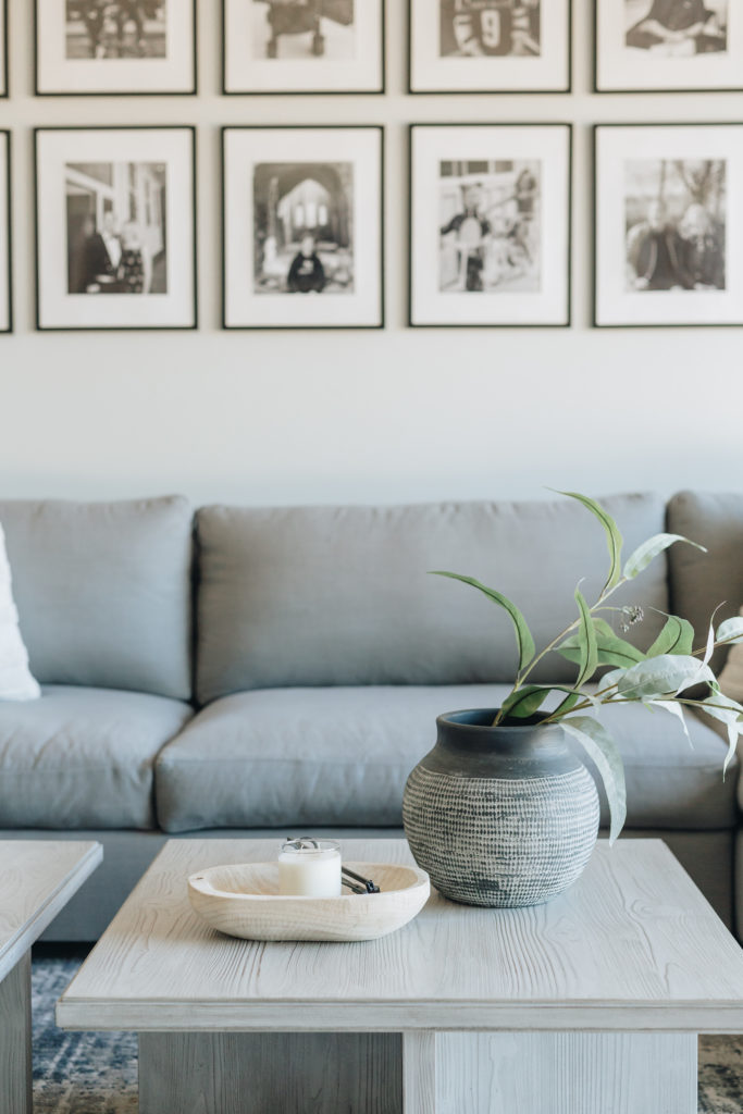
You’ll notice in this entire home, we used the same wall color throughout, same wood finishes throughout, and the same accent colors throughout. This helps the home have a cohesive flow, but still different and fresh. The wood finishes used on the floating mantel is the same wood finish on the floating shelves in the kitchen, the same wood finish in the mudroom, as well as on the vanity in the powder bath (you’ll see that soon!). The cabinet color we talked about in the kitchen (Drift of Mist) was also the same color used on the wood accents in the family room. Talk about the perfect pairing.
