February 16, 2023
accent walls, accessories, bathroom, Built Ins, Dining Room, earthy colors, family room, Game Room, home design, interior design, kitchen, kitchen accessories, Kitchen Nook, Light Fixtures, lime wash, neutral, paint colors, pattern tile, Playroom, Primary Bathroom, Primary Bedroom, remodel, textured walls, textures, tile, Wallpaper, white oak
I don’t know if you heard, but our Oak Meadow project set some pretty incredible sales records in the Santa Clarita Valley..and when I say incredible records, I mean, it sold as the highest price home EVER sold in the Santa Clarita Valley. And you know what….we designed all 8000 square feet of that bad boy! All 8 bathrooms, kitchen, theater, basement, office, living & dining room, primary bedroom, 2 lofts, and all the bedrooms. Yea pretty crazy right! Let’s tour some of the main living areas designed by RRI!
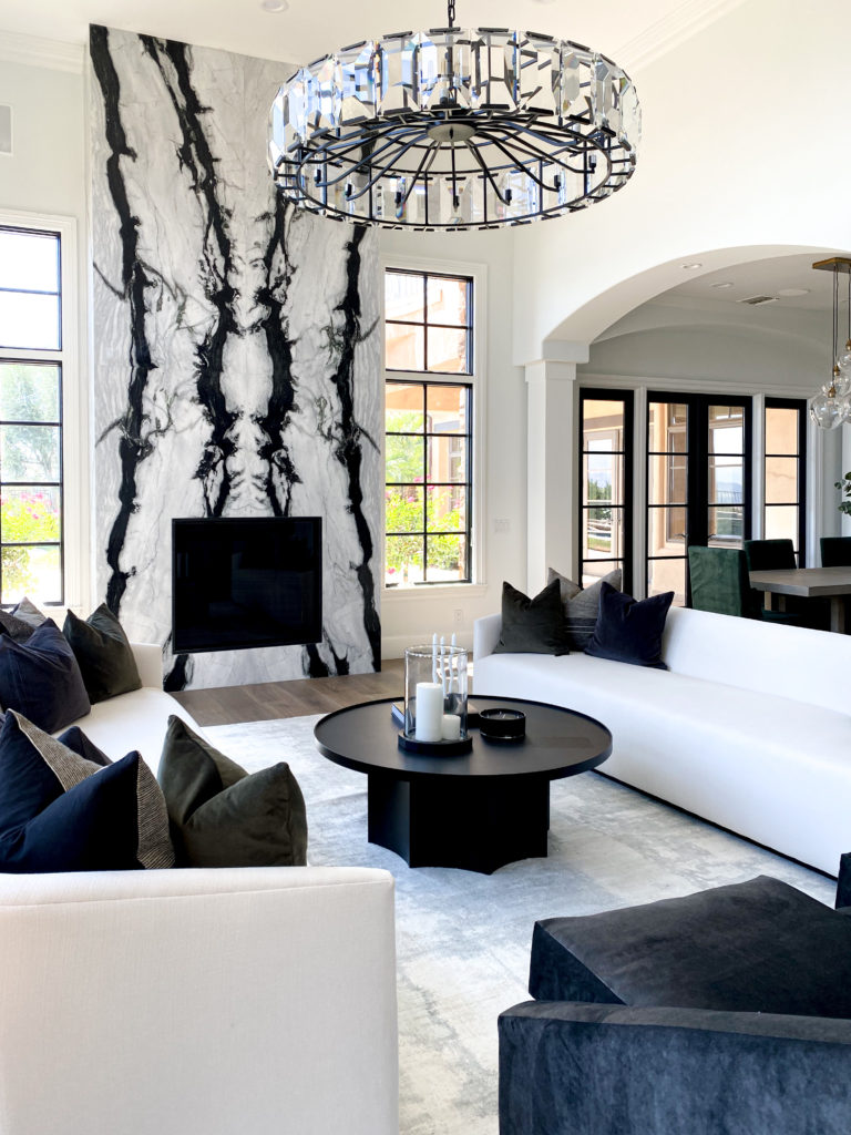
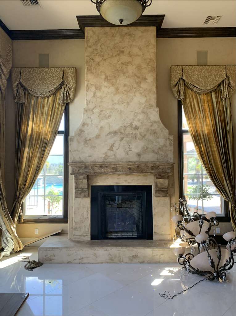
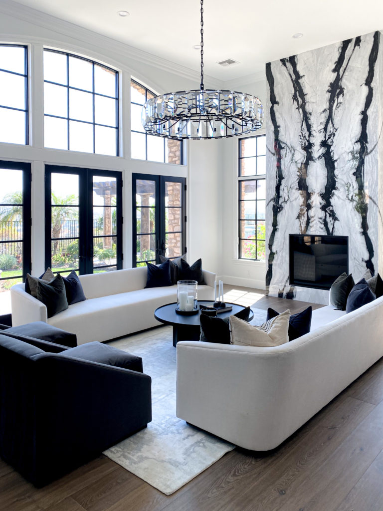
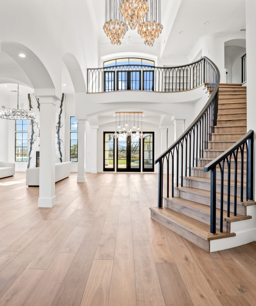
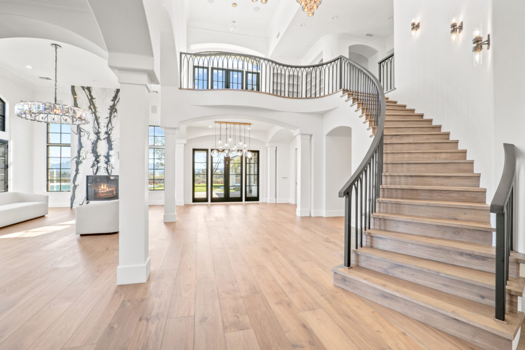
Lets start with the living room/dining room/entry, because this packs some serious punch! The book-matched marble floor to ceiling fireplace was designed to be a statement, and I think we nailed it. It is one of the first places your eye goes when you enter this beauty. The statement railing was a masterpiece that was not an easy task. In fact, it went in and I was NOT happy with it, so it was ripped out and completely re done. The metal detailing with the warm rich wood floors, and the chandeliers throughout these spaces is what draws you in!
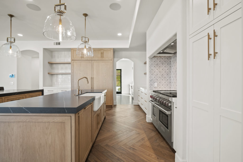
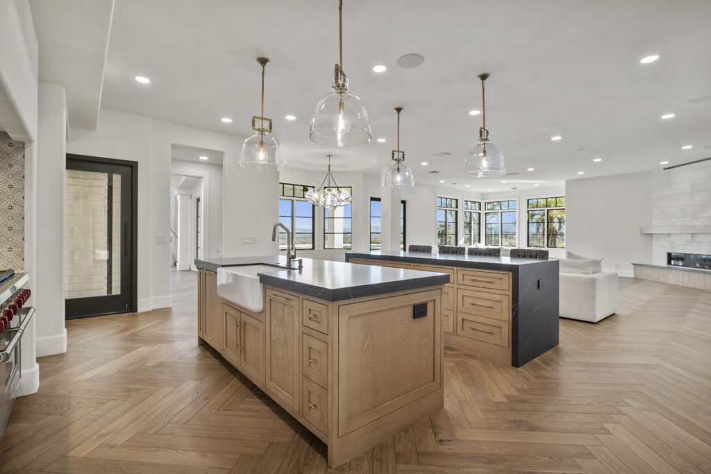
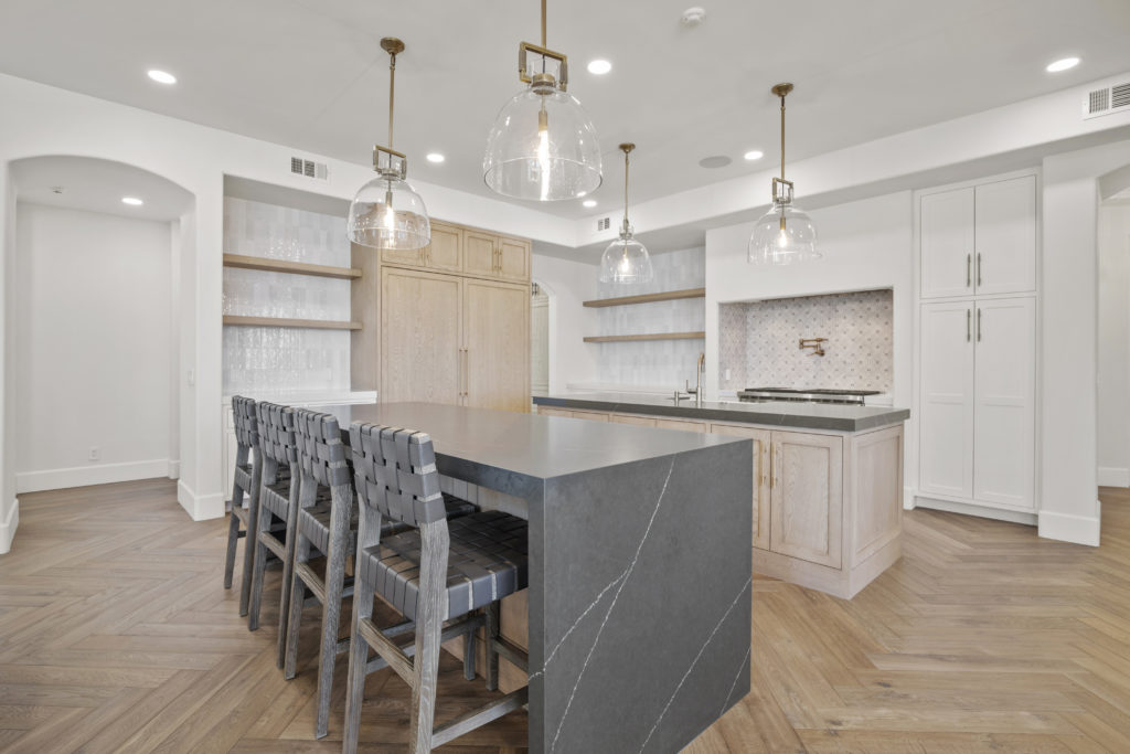
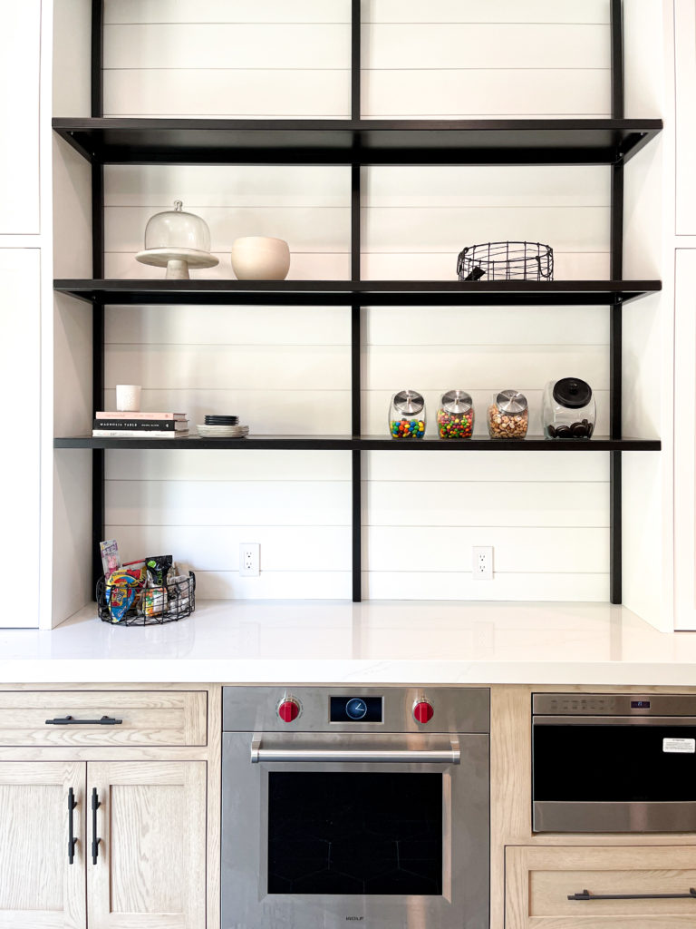
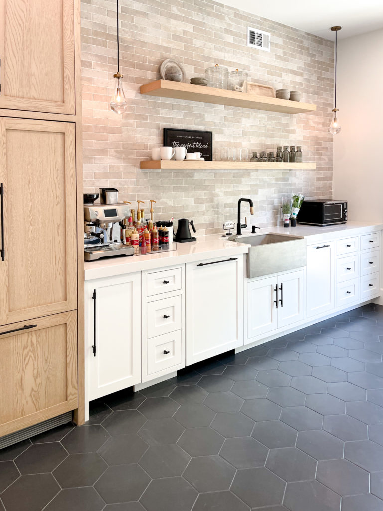
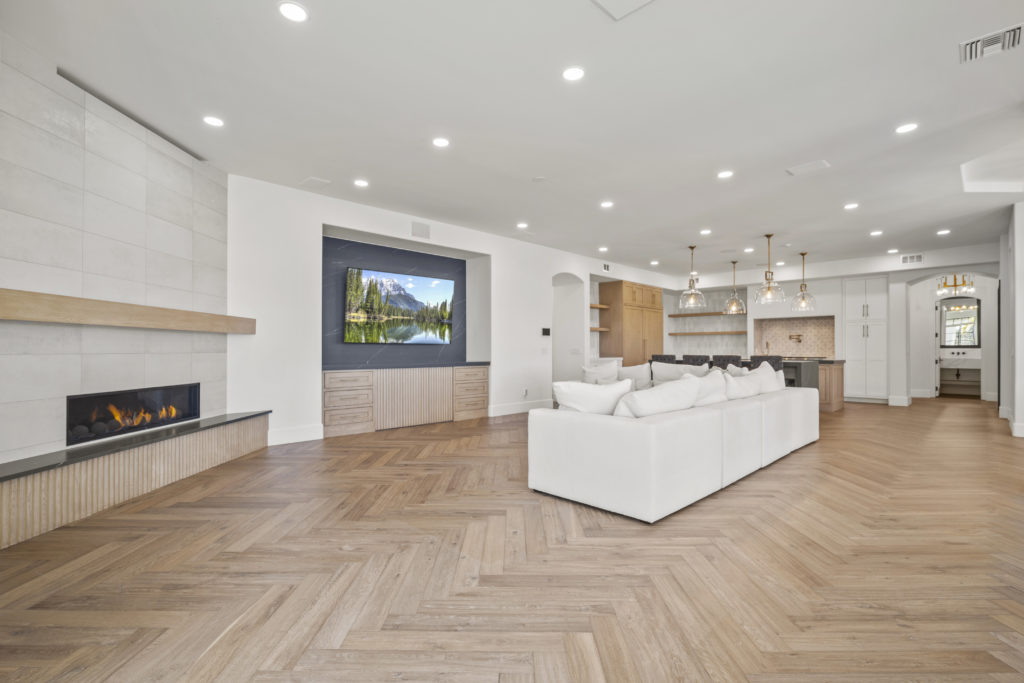
The kitchen and family room spaces are large, and perfect for entertaining. When we were reworking the kitchen, my client wanted to add a scullery to the kitchen. If you don’t know what a scullery is, it is also known as a “dirty kitchen.” Its technically where you cook so you don’t dirty the kitchen everyone sees. I know what you are thinking… who needs that!? Well, in a house of this size and this caliber, YOU NEED IT. So we took over a bedroom, opened a wall and created a “dirty kitchen.” All panel ready appliances in both the kitchen and dirty kitchen, double islands in the main kitchen, and tons of open shelves to give an even more open feel. The white oak cabinets are stained a custom finish (created on site) to coordinate perfectly with the floors. We changed the flooring in here from the rest of the house, to a herringbone pattern to give this space an even more elevated feel. The family room continues with the rich cabinetry with a fluting detail, dark and moody quartz, and layers of tile accents and beautiful lighting. Oh and did I mention, the built in wine room that took over the existing pantry!
