March 9, 2022
accessories, bathroom, family room, Game Room, home design, interior design, kitchen, kitchen accessories, neutral, pattern tile, remodel, tile
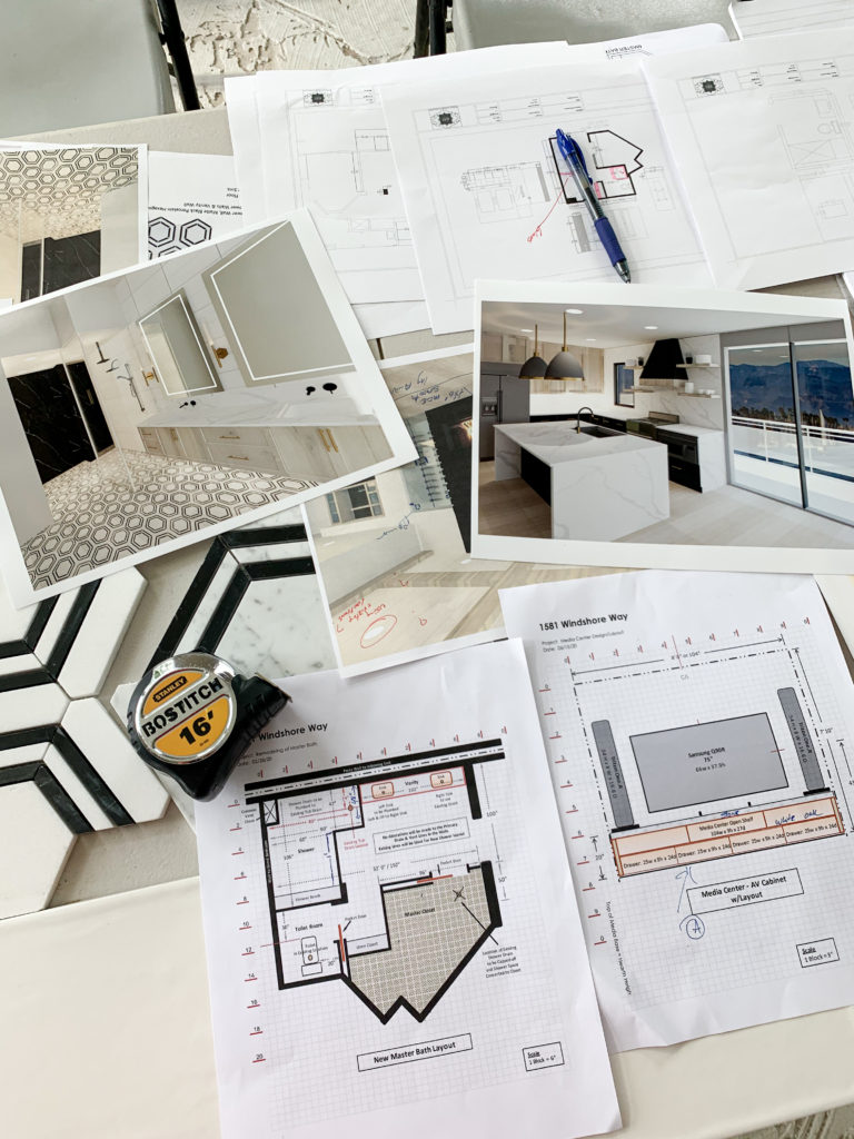
Our Channel Islands project has been a labor of love. This project originally started back in 2019..pre pandemic. Wellll…then you know pandemic hit and this project went on hold. My clients who were living in the house at the time opted to pause starting construction on this masterpiece until things settled down a bit. WELL…things did indeed settle down and construction began the fall of 2020 and we were off to the races!
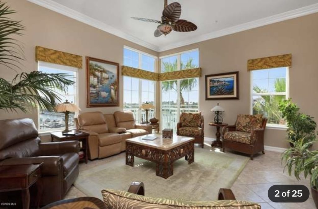
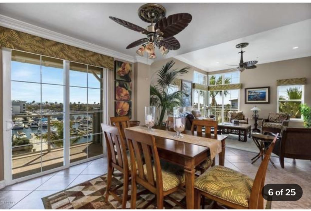
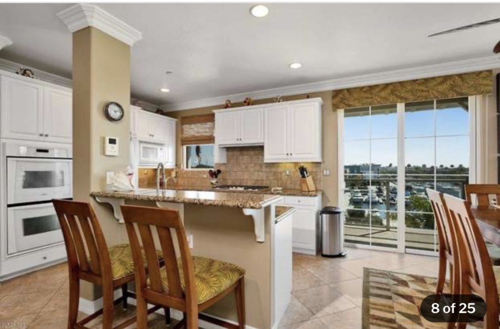
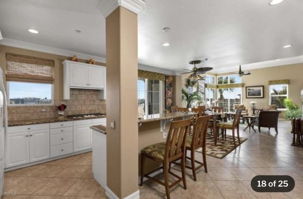
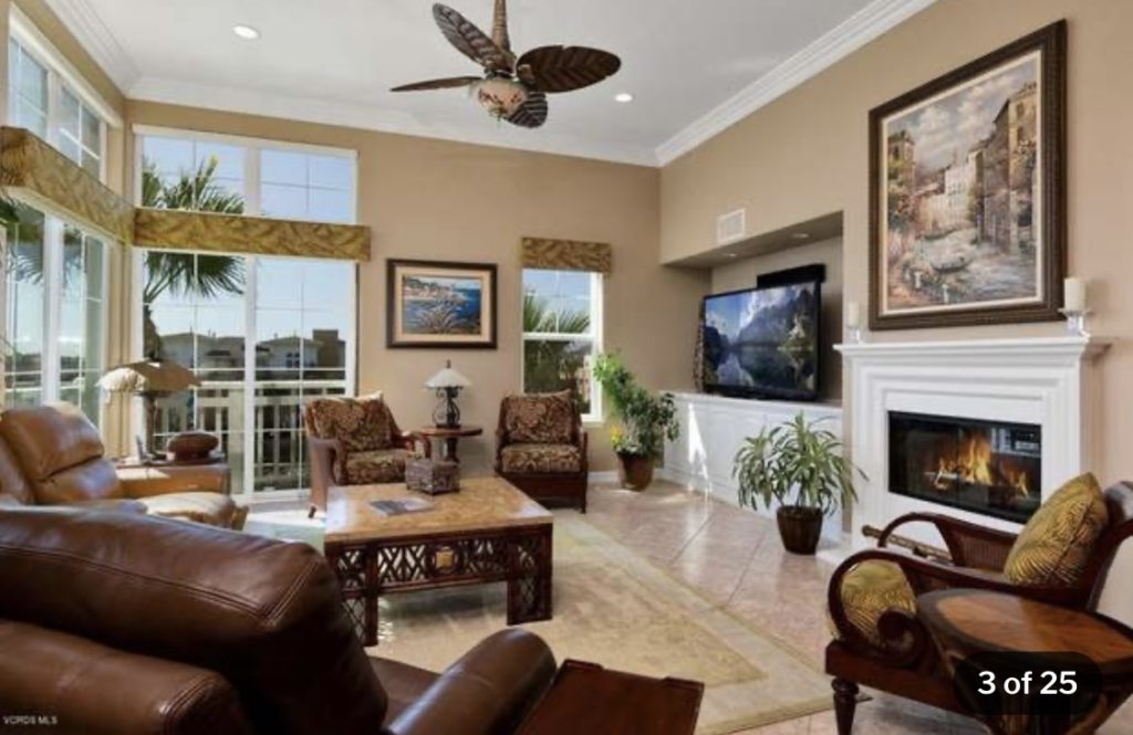
Lets take a look at where this home started..before we dive into the fun stuff! Holy Tommy Bahama! BTW…this was NOT my clients style. This was the look before they bought the home! Just had to clear the air so you all didn’t think this was theirs!
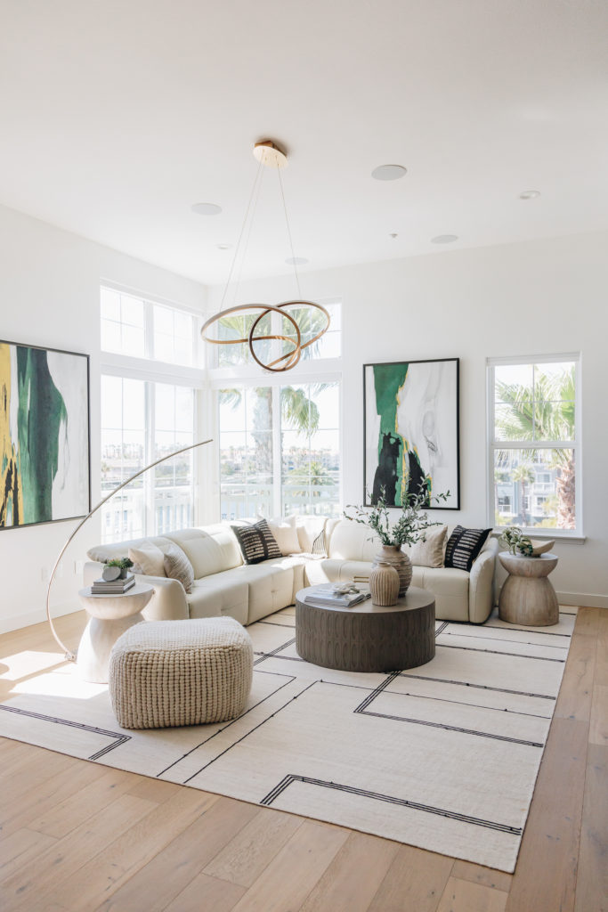
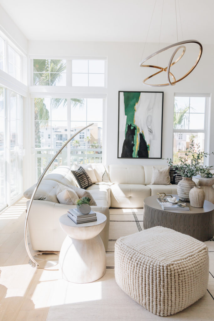
This client wanted a modern oasis and because of its location, overlooking the Channel Islands Harbor, i knew we needed some wood elements to warm it up! And wood elements we did…and we did throughout!
Let’s start with the family room which originally started with a teeny tiny builder fireplace and some weird built ins on each side. And when i say weird..i mean these out-coves with a dropped ceiling and very 1990’s. The ceiling height in this room is 15′ and we needed to show this off!
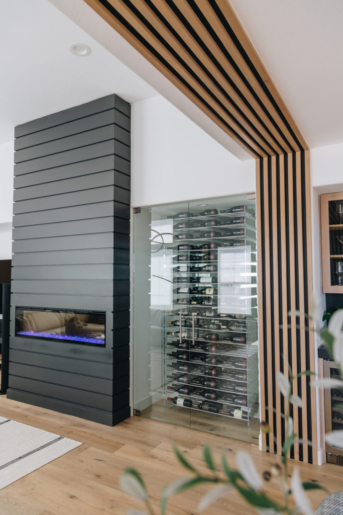
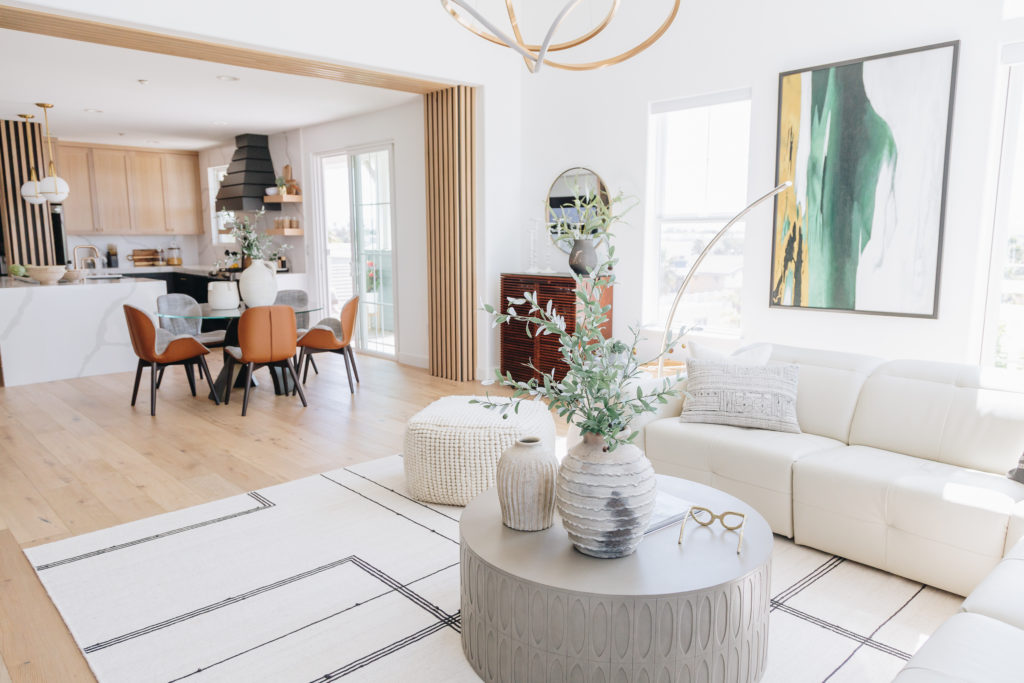
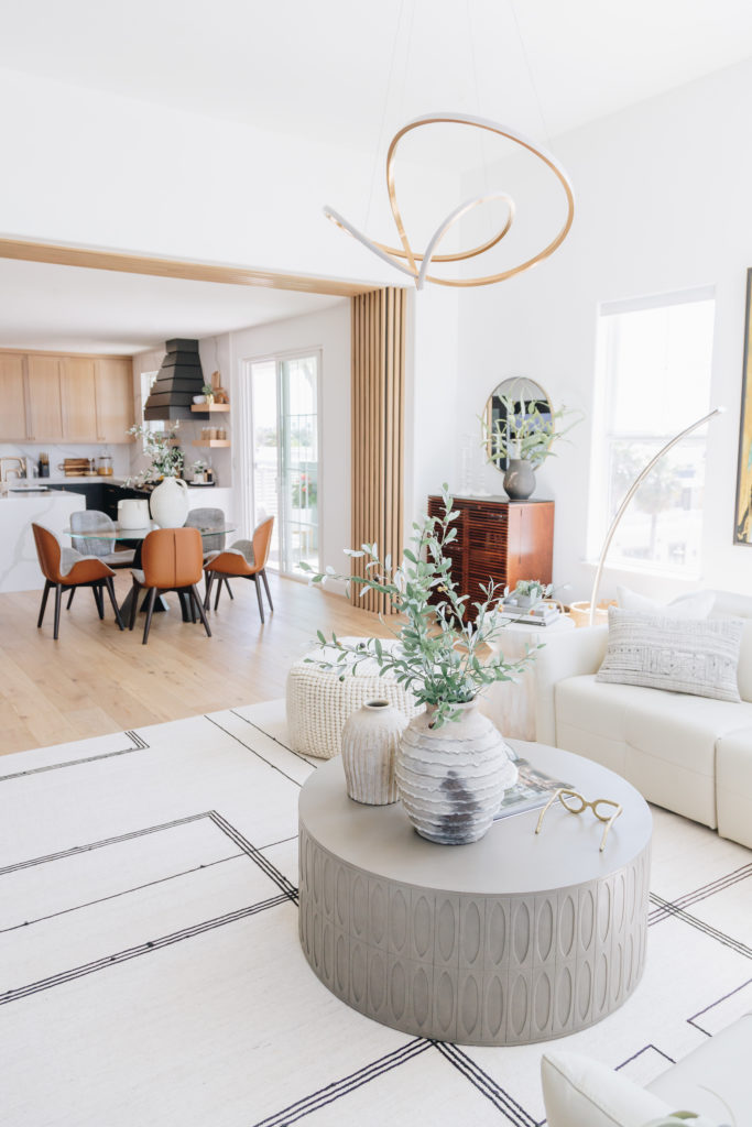
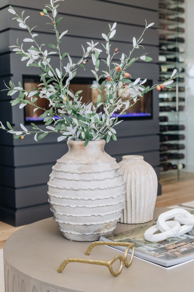
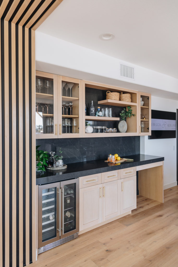
We brought the focal point to where it should have been..the fireplace (i mean besides the view), and actually made a very dramatic modern fireplace with a new insert and took the tongue and groove shiplap all the way to the ceiling. Again, it’s all about that ceiling height in here. My clients love wine as much as i do so a wine wall was the perfect addition. A wine display that truly showcases those wine bottles behind the double glass doors! I knew I also wanted a dramatic transition between the kitchen and family room. YES, we all love a wide open space, but this particular home needed just a bit of separating. So bringing in custom wood slats, was the perfect addition! (YES my contractor hated me for this, but DANG look how good it looks)
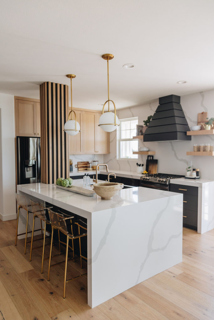
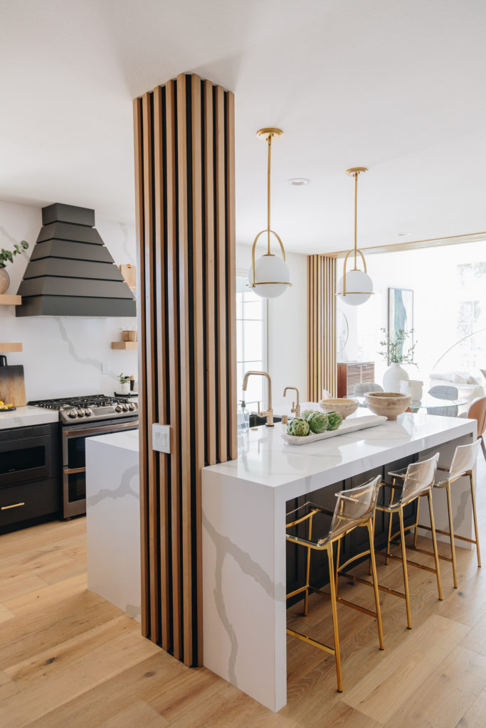
The kitchen was the next hurdle. There was not a ton we could do in here. We were not able to push any walls out to expand, and were could not move the big post in the middle of the kitchen as it housed plumbing for the units below this one. So we had to make it work.
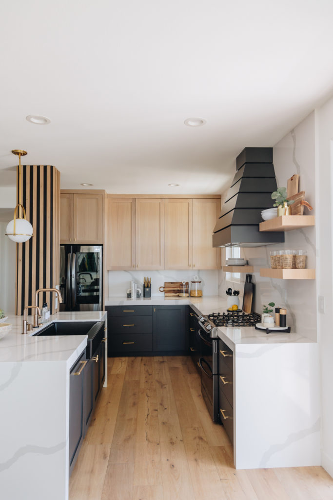
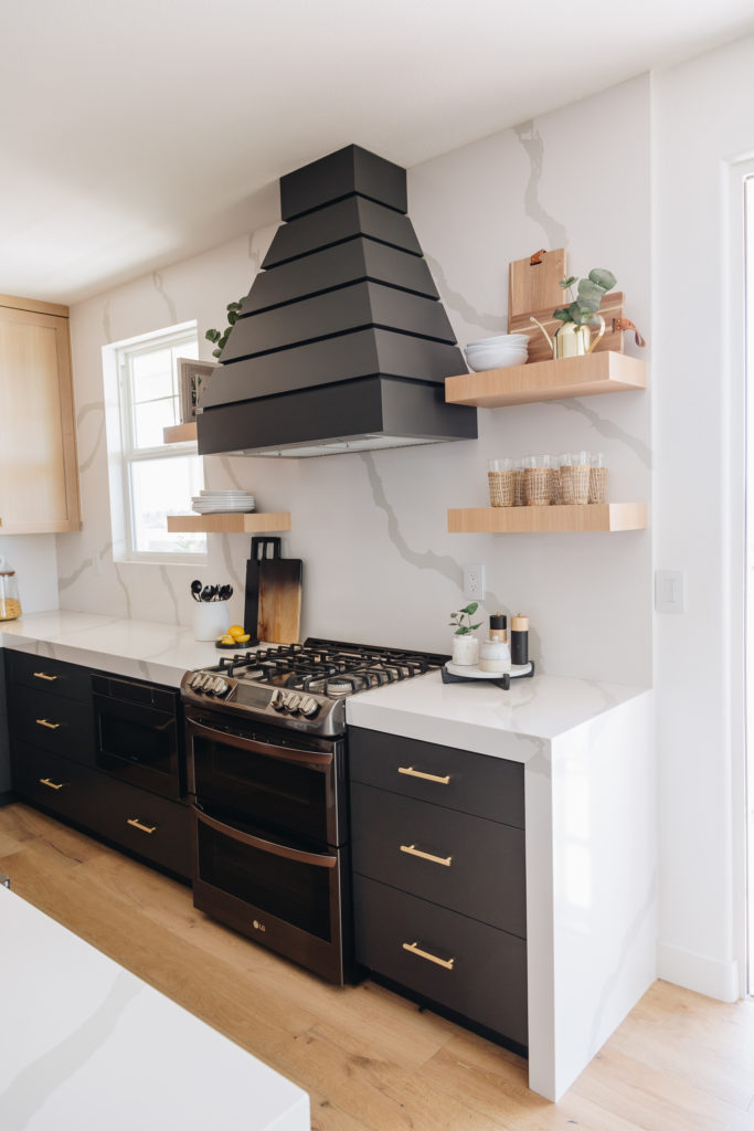
First off..leveling out the island to one larger island was key. Eliminated some of the upper cabinets to make it feel larger and more open was another must. We used a two tone custom cabinet..white oak upper cabinets with a dark paint grade lower cabinet. Lighter quartz countertops with waterfall edges makes takes this kitchen to the next level!
And that post was still there so we wrapped it again in the custom wood slat detail to tie in the other areas. And honestly, now it looks like an architectural feature!
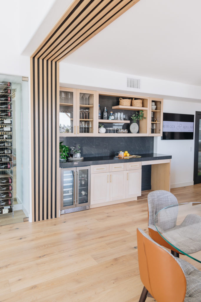
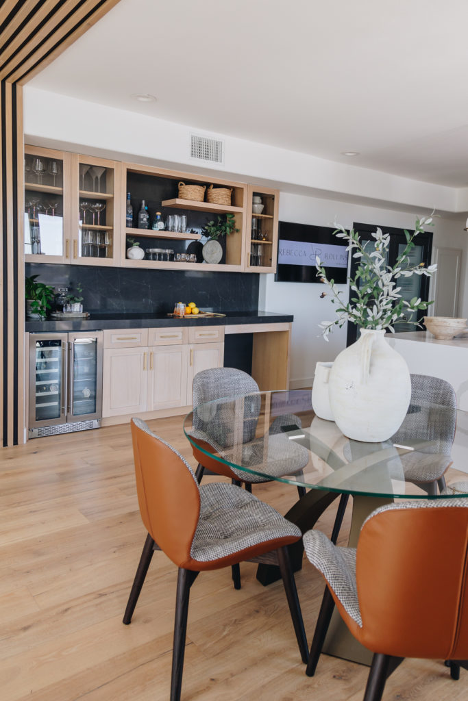
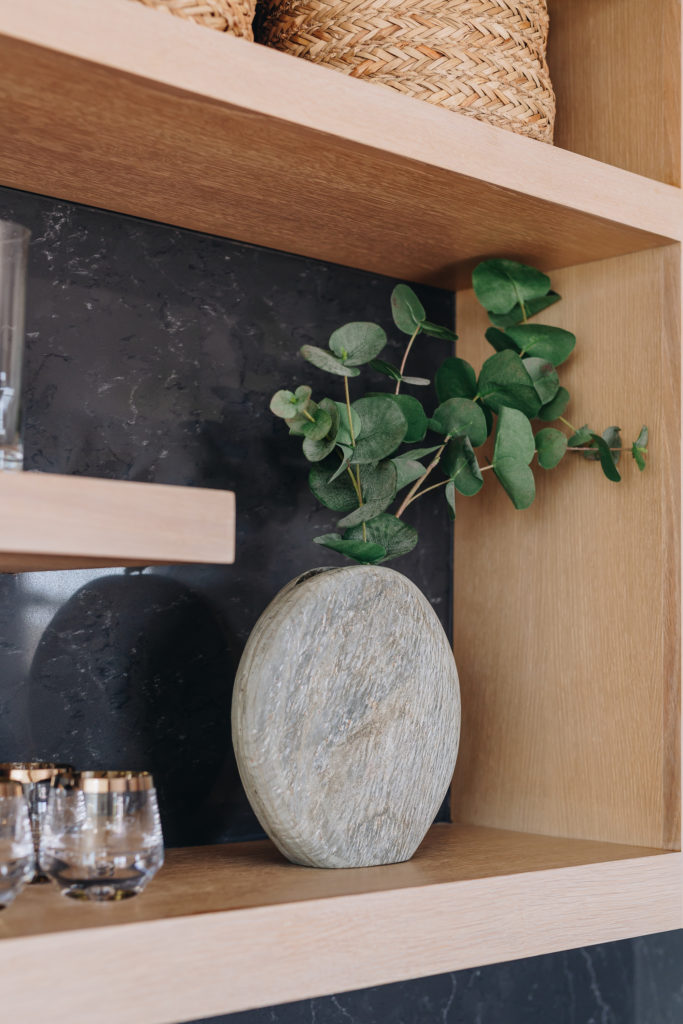
And then this bar area. Did i mention how fun my clients are. They like to have a good time! So a bar where nothing stood before was a great way to bring in more cabinetry and also a great way to incorporate their interests too! We used a dark quartz for this countertop and backsplash but still paired it with the same custom white oak cabinets from the kitchen. That way it still felt similar in looks but was different. Its all about that mixing and matching!
The wide planked open grain wood floor rungs throughout the house. Along with the white crips white walls. You all know the only white I use is Chantilly Lace by Benjamin Moore. The walls, ceilings, baseboards and doors are all this white.
Stay tuned for our next blog, with the reveal of the guest bathroom, entry way, master bedroom & bathroom! Coming VERY soon!
