December 30, 2022
accent walls, accessories, bathroom, Built Ins, earthy colors, Game Room, home design, interior design, Light Fixtures, neutral, pattern tile, Playroom, remodel, tile, Wallpaper
If you have kids then you know, they take over all the entire house! When we were talking with our clients, one big change they wanted from their previous home was a space for the kids to hang out and all of their friends too..so they didn’t lock themselves in their rooms! Which I was all about (I have a teenager!). We put our heads together and came up with some great spaces for these kids!
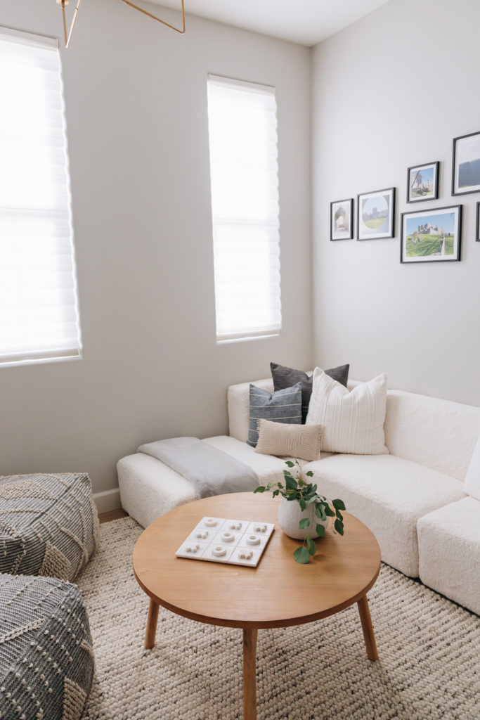
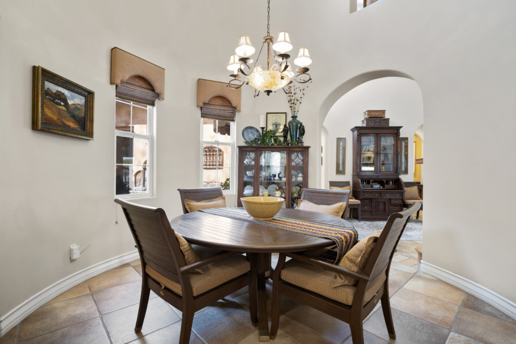
The first space was the “dining room” which lets be real..gets used all of 2 times a year. They wanted a space that was a chill lounge that a group of kids could hang out in! Since this room was off the entry it not only had to be functional but it had to look good too. This ended up turning into a gaming room for their preteen son and a lounge for all of his friends could hang out in too. And to this day, I still get updates about how much the kids love to hang out in there!
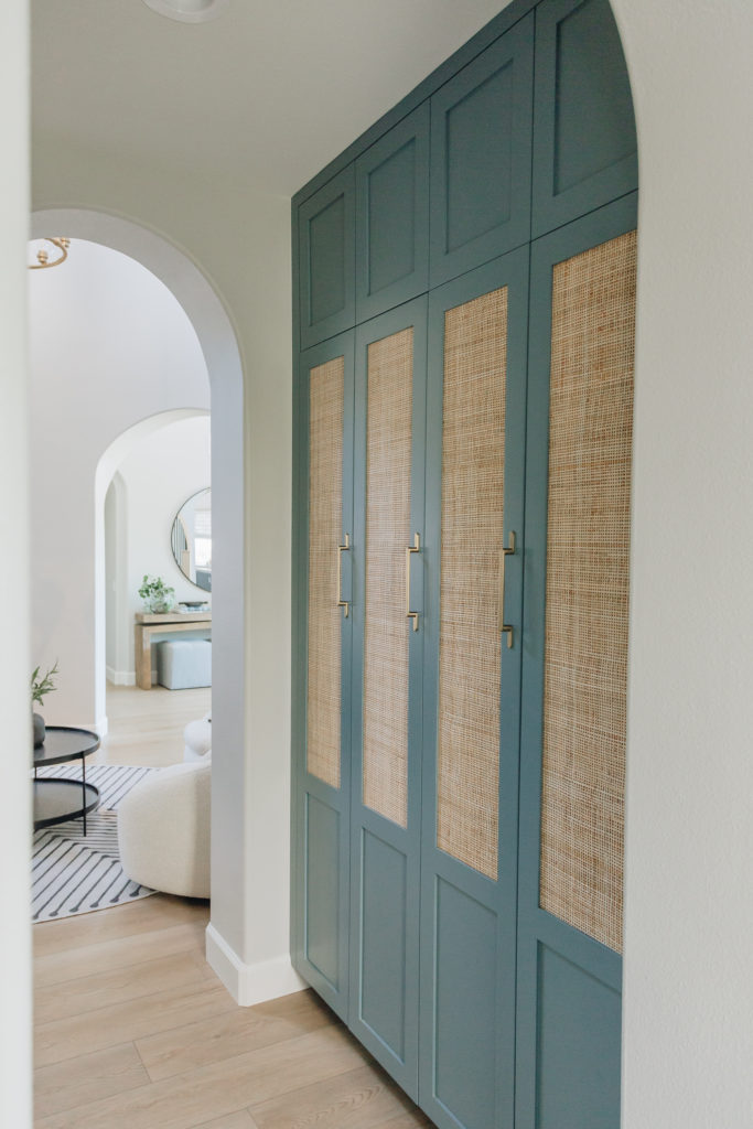
Right off of that was what used to be a butlers pantry that we removed since we eliminated the dining room. We actually turned this space into custom lockers with drawers and shelves along with outlets in each locker. This is where the purses and backpacks go along with each individual charging port!
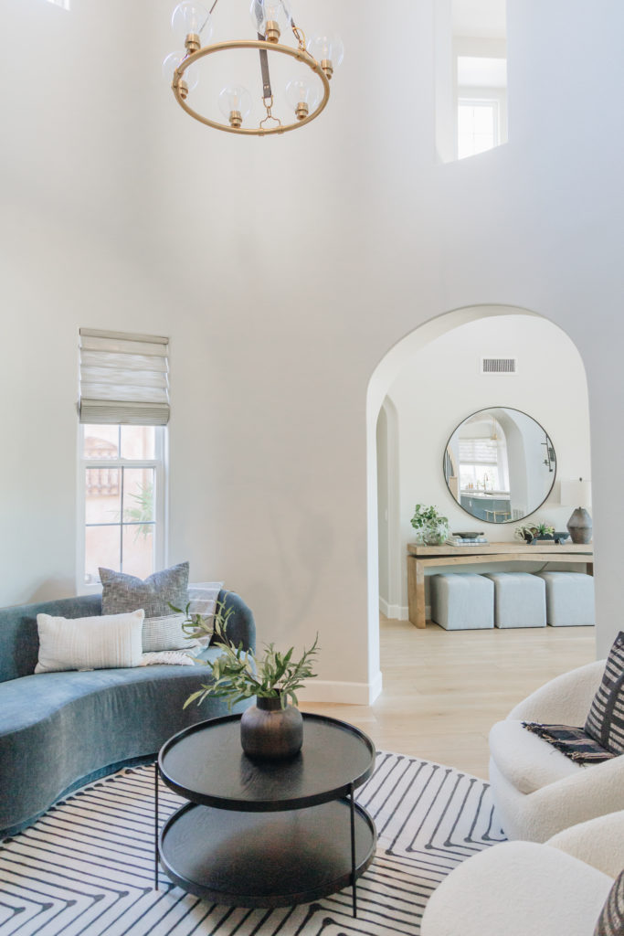
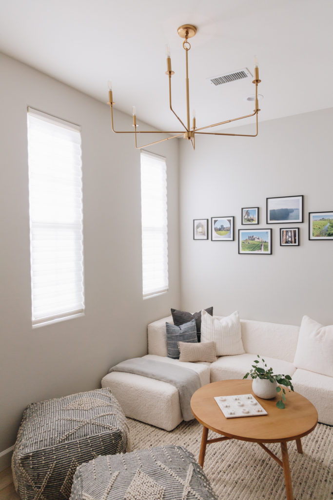
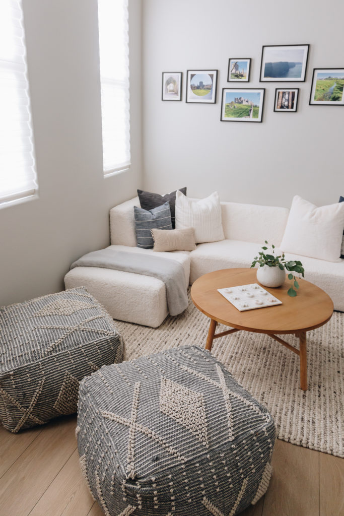
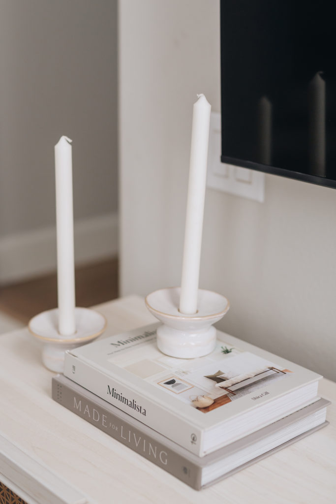
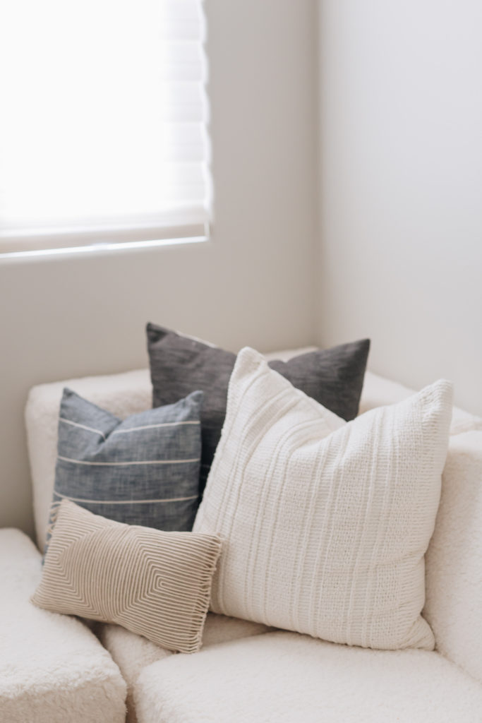
The upstairs lounge is off the kids bedrooms and is a very awkwardly shaped. We wanted this space to be another hang out space but more neutral feeling so either their daughter or son could hang out in here. We added a cosy boucle low profile sectional sofa, a couple ottomans and of course a TV. This room is where all of the teenager girls hang out and watch movies and you know..gossip!
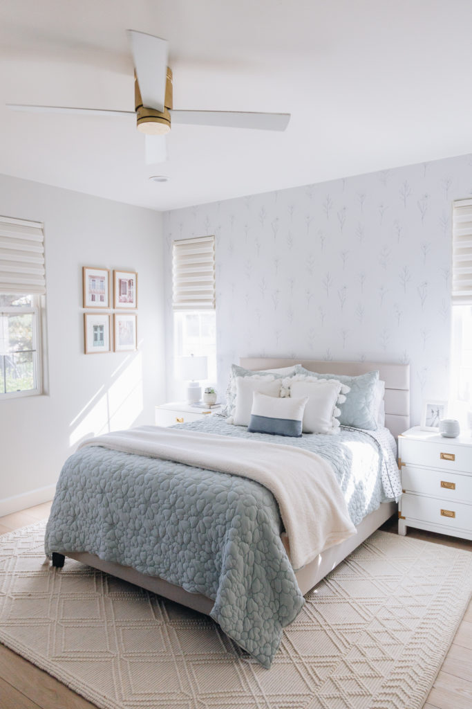
The upstairs kids bedrooms & bathrooms were designed with the kids input of course. They each have their own unique style and colors they like. We took those colors and we ran with it creating a Parisian style room that their teenager daughter can grow into. Their daughter loves books so having the books on display was a must! This large open space was calling for a “library” type set up! She also loves the color blue, so that was incorporated in both her bedroom & bathroom.
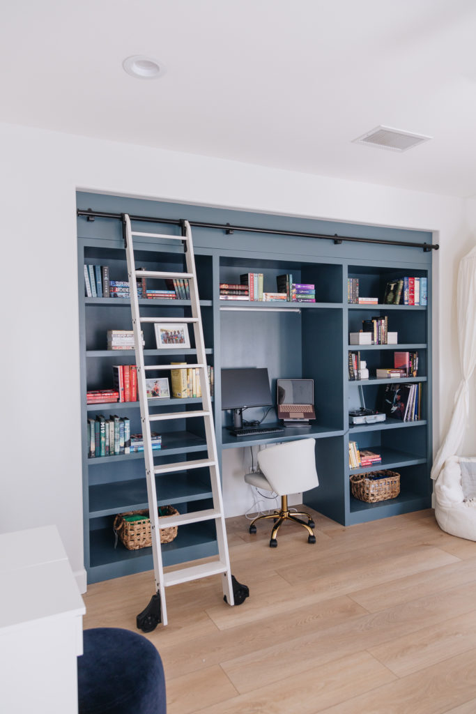
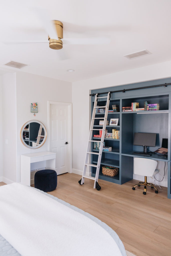
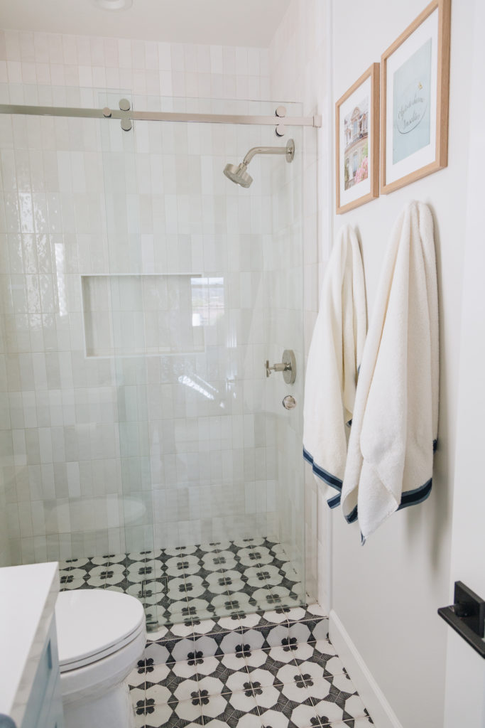
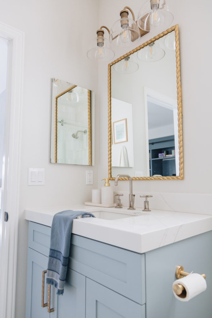
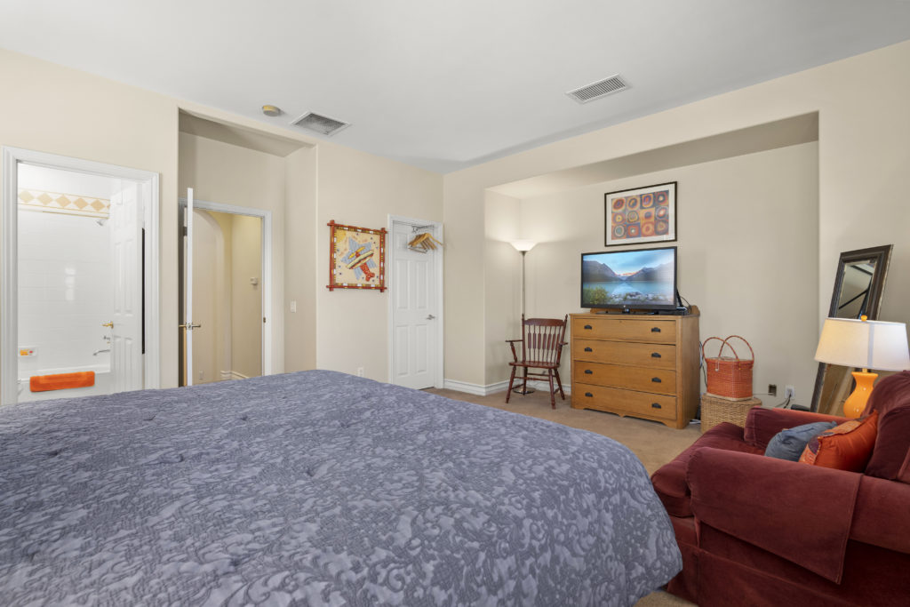
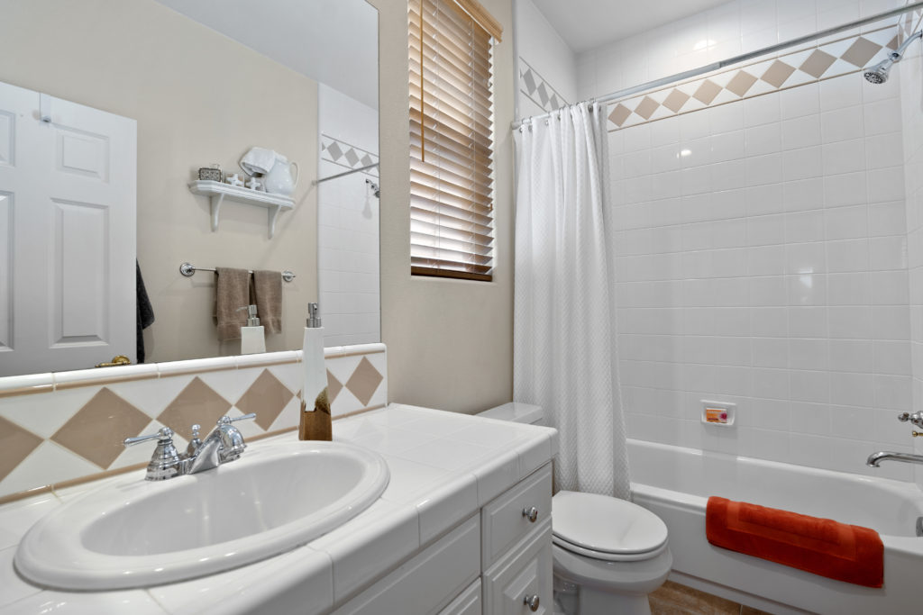
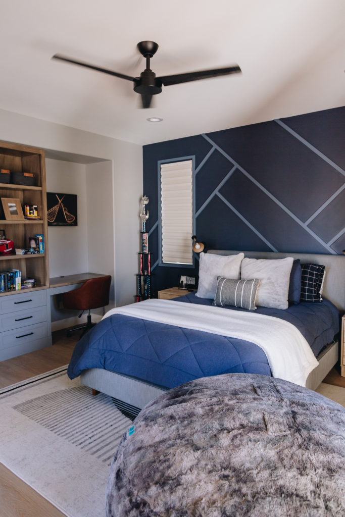
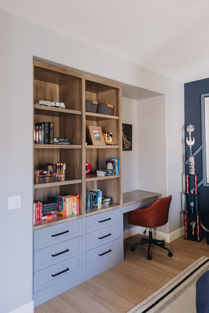
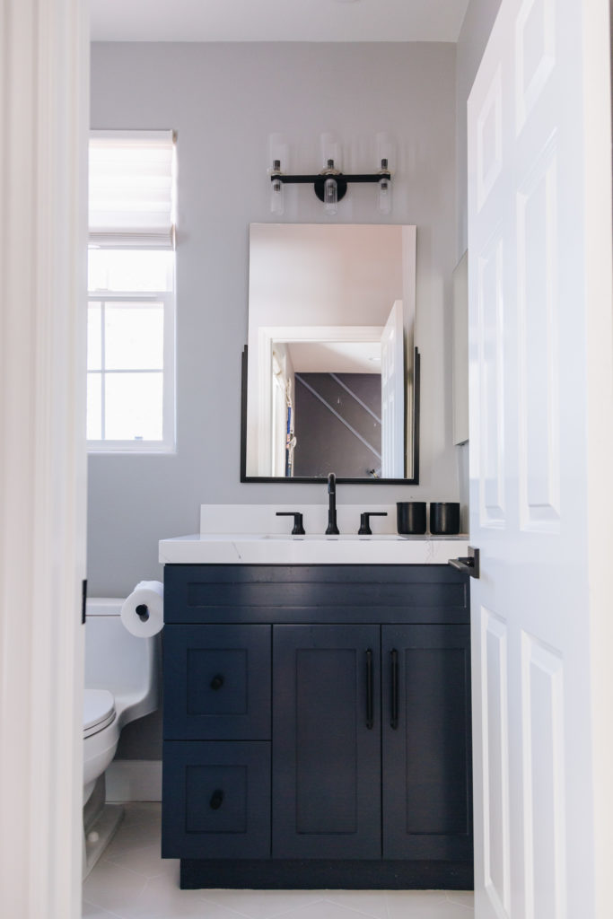
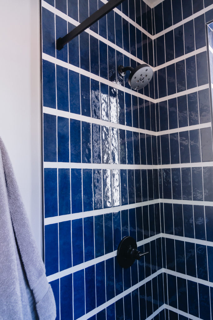
Their son didn’t care as much except he wanted a big comfy love sac him and his friends can jump into. Literally his only request! HA! He also loved blue tones so we designed an accent wall that had a modern 2 tone design to give some depth. The shower we brought in a rich blue tile with a larger grout line to give a more “patterned” design, and break up the subway style tile; and paired a navy blue vanity which was the perfect addition to this pace. We designed this space with more moody colors mixed with wood tones and something their son could enjoy for years to come.
