June 25, 2024
accent walls, accessories, home design, interior design, Light Fixtures, neutral, paint colors, Primary Bedroom, remodel, textured walls, textures, Uncategorized, white oak
When you hire Rebecca Rollins Interiors, you can be as hands-on (or hands-off) as you want! We love either style of client.
For our Tim Tom Project, they were hands-on and SO. MUCH. FUN! They had the best sense of style and went for all of our fun ideas.
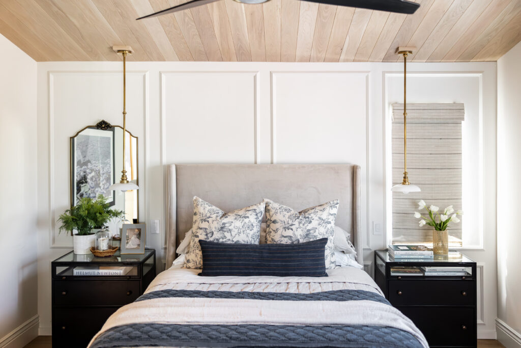
In this project, we aimed for high design and lots of mixing of texture, metals, and every other leap of faith that we could convince them to take in the design world!
When designing a space, we always try to keep the palette neutral so that it can easily changed with seasons, but we always pick a base color.
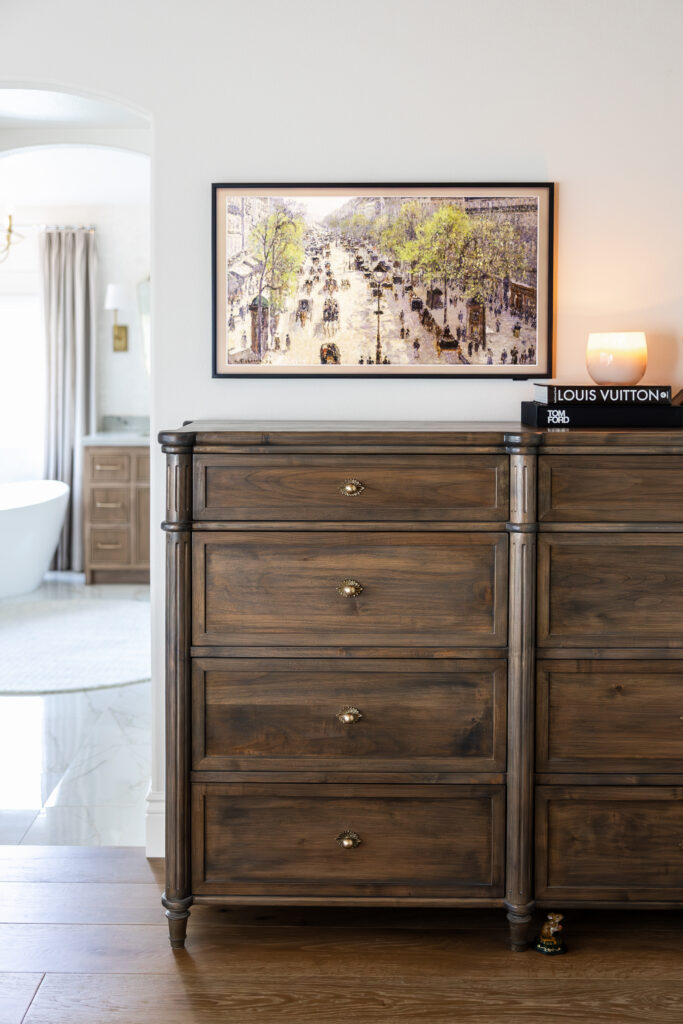
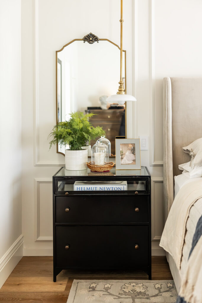
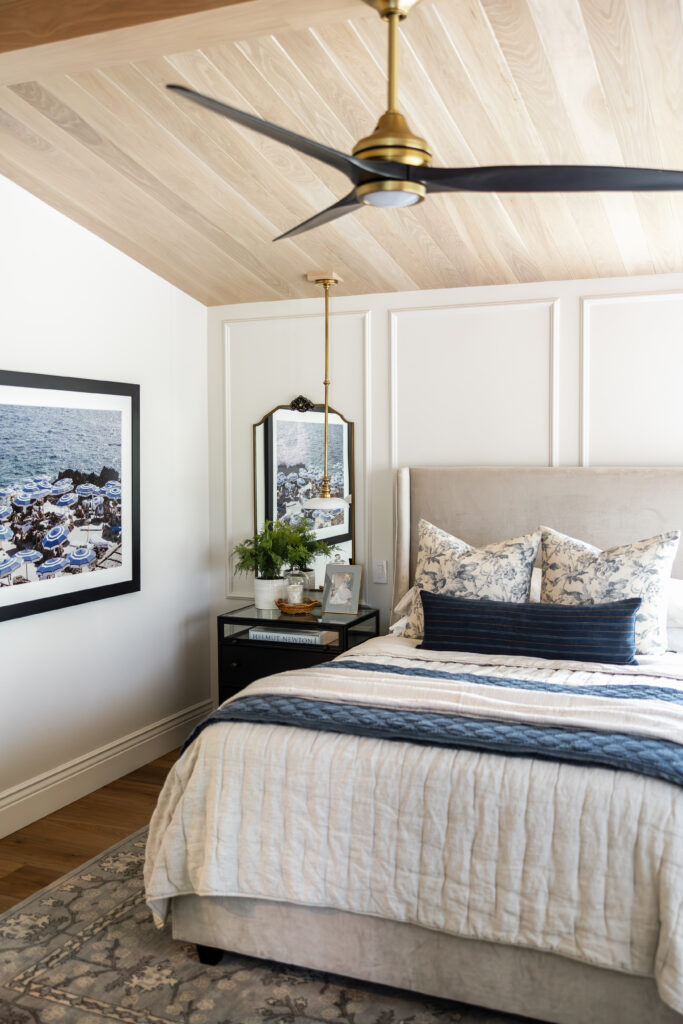
Here we went with a mixture of black and brass, lots of natural woods, and linen to soften the space. Last but not least, we couldn’t forget a pop of navy. This created the perfect balance of softer tones and rounded it out with some moody blues and black.
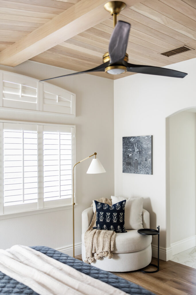
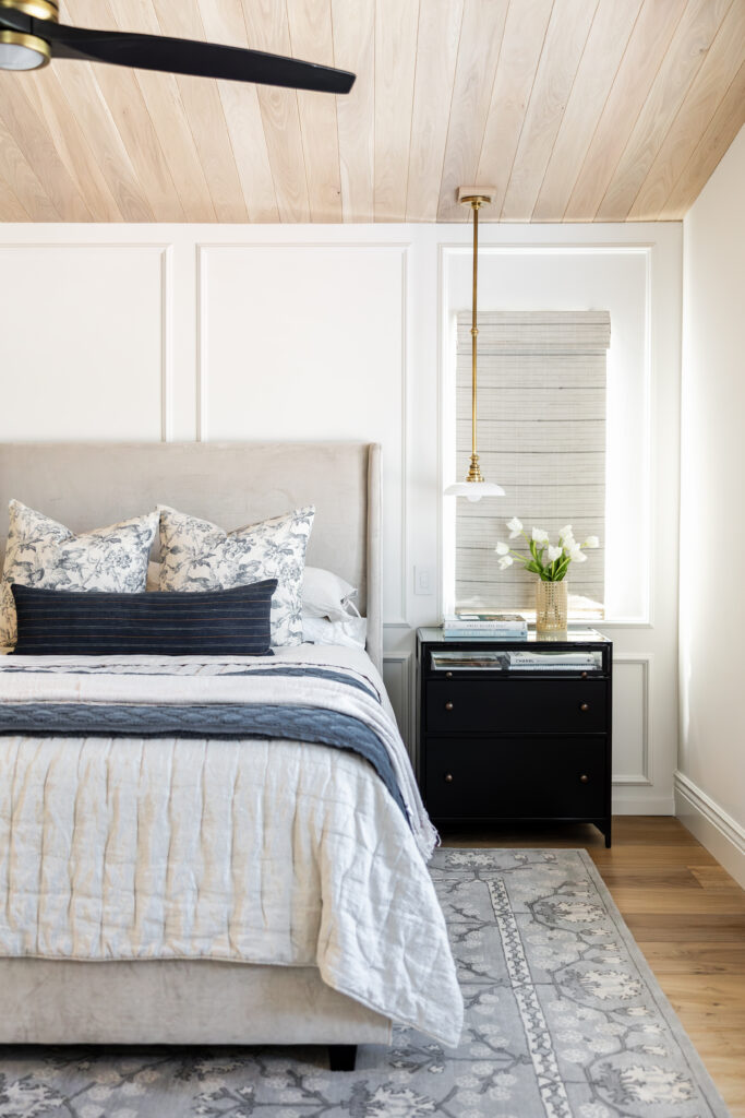
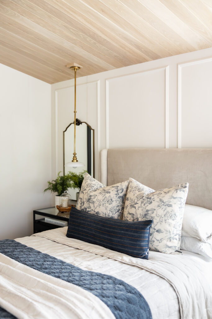
The vaulted ceilings lent themselves for a beautiful feature ceiling where we chose a warm natural white oak with an emphasis on the center beam. The walls we chose “Classic Gray” by Benjamin Moore and some trim work accenting the largest wall.
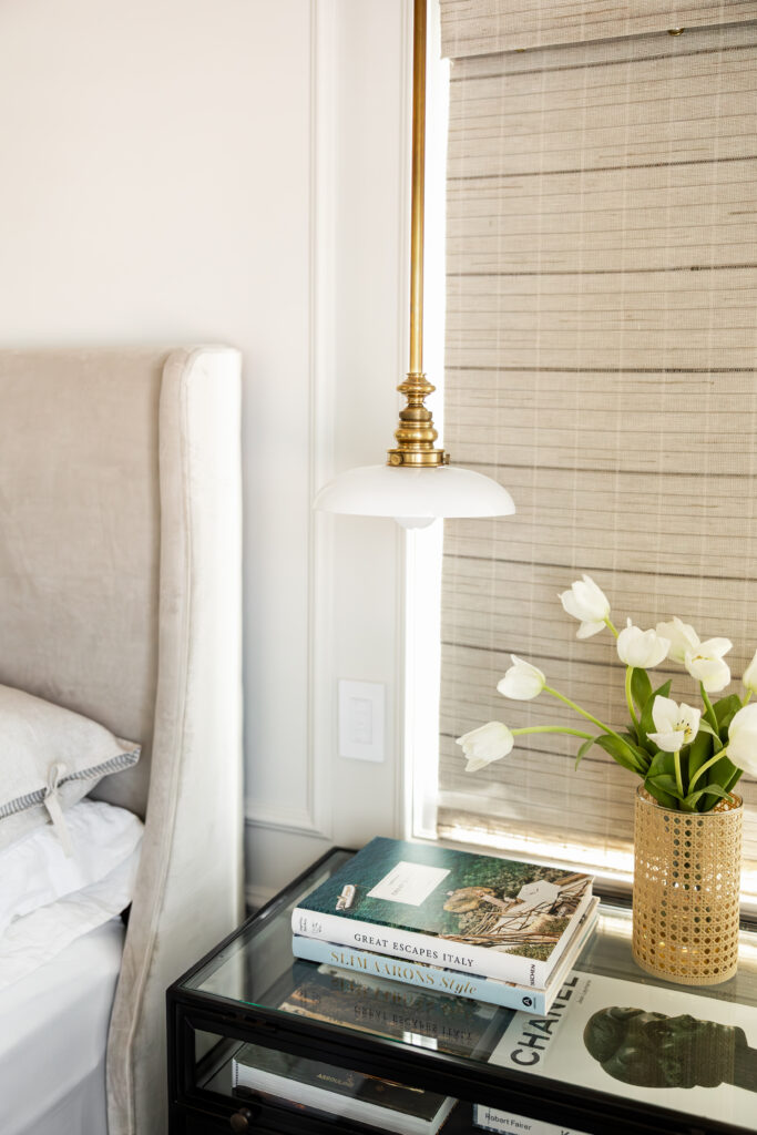
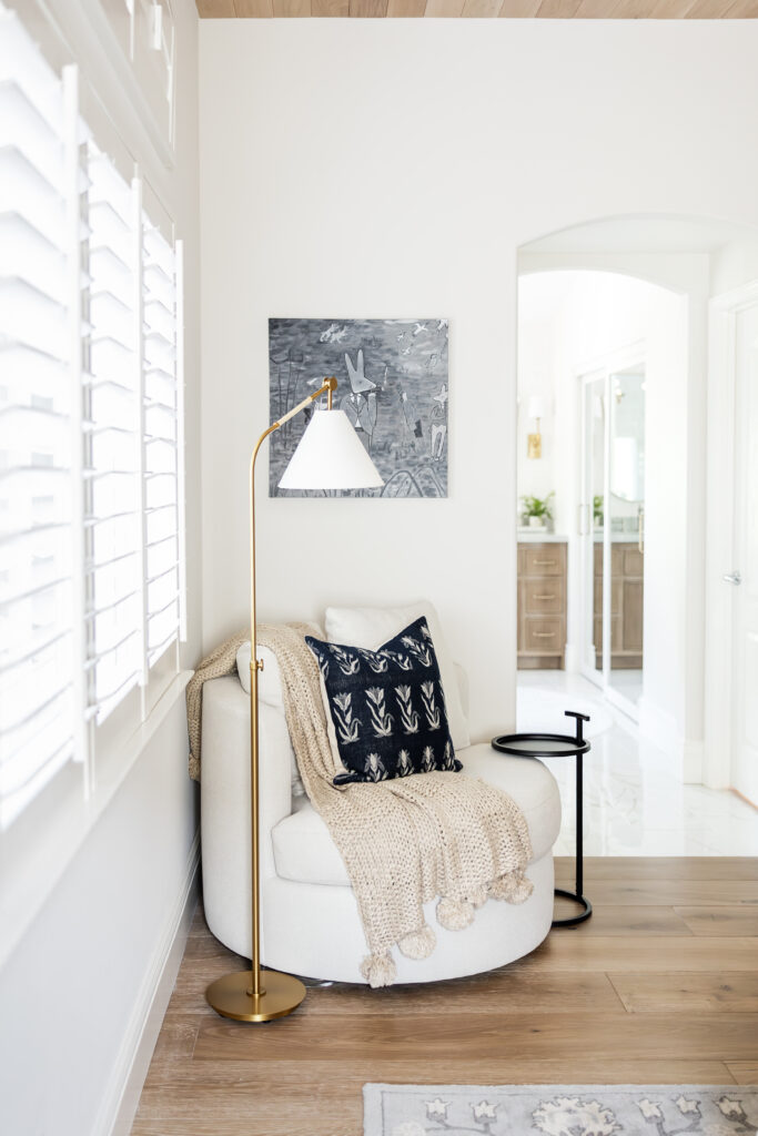
In this space, we flanked the custom bed with two beautiful hanging pendants that landed perfectly over each nightstand. The combination of the brass tones with the milky white glass paired perfectly with the floor lamp that we used to create the most cozy reading spot. Nestled in the corner, right in front of the window for natural light, sits the most comfortable and inviting chair for you to cozy up in.
This room married both traditional accents and modern fixtures to create the most luxurious and timeless primary suite for our clients to enjoy.
